 zabloo
Container
The box that groups other nodes and lays them out. It draws nothing of its own — and one field on it gives a whole set of children a shared behavior.
primitivesince v1not focusable
A Container is a box that holds other nodes and decides
where they sit. It has no content and no size of its own: it is as big as what
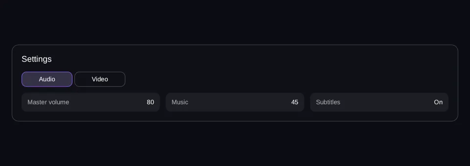
is inside it, or as big as the space its parent hands it. Picture a settings
panel — the card, its title row, the tab bar and each tab’s contents are all
Containers, nested. You reach for one whenever something needs grouping, spacing
or a direction, which in practice is most of a screen.
Viewport: 960 × 340
- hover — off
- pressed — off
- focused — off
- selected — off
- disabled — off
Reported from the last painted frame
Not running — press Run to draw this on the GPU.
import { Column, Row, Tab, Tabs, Text } from "@zabloo/react";


/**
 * One "setting: value" line: a Row, and the flex pass doing all the work.
 *
 * `width` plus `grow` is what lets the panel below wrap them (ZAB-153): the
 * width is the base a wrapping row measures against, and `grow` shares out
 * whatever the line it lands on has left. Three across a desktop, two on a
 * tablet, one on a phone — decided by arithmetic, not by a breakpoint.
 */
function Line({ name, value }: { name: string; value: string }) {
  return (
    <Row
      layout={{
        width: 240,
        grow: 1,
        padding: "{space.3}",
        justify: "space-between",
        align: "center",
      }}
      style={{ background: "{color.slot}", radius: "{radius.md}" }}
    >
      <Text style={{ color: "{color.muted}", fontSize: "{text.sm}" }}>{name}</Text>
      <Text style={{ color: "{color.text}", fontSize: "{text.sm}" }}>{value}</Text>
    </Row>
  );
}

export default function ContainerTabs() {
  return (
    <Column
      // `align: "stretch"` on the ROOT is what hands the panel the view's own
      // width; centring it instead would pin the panel to its content and no
      // change of viewport could reach it (ZAB-153).
      layout={{ grow: 1, justify: "center", align: "stretch", padding: "{space.6}" }}
      style={{ background: "{color.bg}" }}
    >
      <Column
        id="panel"
        // `align: "stretch"` is what gives the children the panel's full width;
        // without it they measure to their content and `space-between` above has
        // no leftover space to distribute.
        layout={{ padding: "{space.5}", gap: "{space.4}", align: "stretch" }}
        style={{
          background: "{color.surface}",
          radius: "{radius.lg}",
          borderWidth: "{border.hairline}",
          borderColor: "{color.line}",
        }}
      >
        <Text style={{ color: "{color.text}", fontSize: "{text.lg}" }}>Settings</Text>

        {/* One `group` field, and the SDK shows exactly one panel. A `<Tab>`'s
            own props dress its BAR BUTTON — the active one through
            `states.selected`, a state the group derives. */}
        <Tabs
          selected={0}
          bar={{ layout: { gap: "{space.1}" } }}
          // The group is a Container like any other: without `stretch` the
          // panel below would measure to its own content instead of taking the
          // width the settings card offers it.
          layout={{ gap: "{space.3}", align: "stretch" }}
        >
          <Tab
            variant="secondary"
            layout={{ width: 104, padding: "{space.2}", justify: "center", align: "center" }}
            states={{
              selected: {
                style: { background: "{color.brand-soft}", borderColor: "{color.brand}" },
              },
            }}
            label={<Text style={{ color: "{color.text}", fontSize: "{text.sm}" }}>Audio</Text>}
            // The surface moved to the lines themselves: laid side by side on a
            // wide viewport, one shared background reads as a single strip of
            // text rather than as three settings.
            panel={{ layout: { gap: "{space.2}", align: "stretch" } }}
          >
            <Row layout={{ wrap: true, gap: "{space.3}", align: "start" }}>
              <Line name="Master volume" value="80" />
              <Line name="Music" value="45" />
              <Line name="Subtitles" value="On" />
            </Row>
          </Tab>

          <Tab
            variant="secondary"
            layout={{ width: 104, padding: "{space.2}", justify: "center", align: "center" }}
            states={{
              selected: {
                style: { background: "{color.brand-soft}", borderColor: "{color.brand}" },
              },
            }}
            label={<Text style={{ color: "{color.text}", fontSize: "{text.sm}" }}>Video</Text>}
            // The surface moved to the lines themselves: laid side by side on a
            // wide viewport, one shared background reads as a single strip of
            // text rather than as three settings.
            panel={{ layout: { gap: "{space.2}", align: "stretch" } }}
          >
            <Row layout={{ wrap: true, gap: "{space.3}", align: "start" }}>
              <Line name="Resolution" value="1920 × 1080" />
              <Line name="Quality" value="High" />
              <Line name="Fullscreen" value="On" />
            </Row>
          </Tab>
        </Tabs>
      </Column>
    </Column>
  );
}
{
"v": 1,
"tokens": {
"color.bg": "#0b0d13",
"color.surface": "#0e1016",
"color.raised": "#14141a",
"color.line": "#ffffff1f",
"color.line-strong": "#ffffff24",
"color.text": "#ffffff",
"color.muted": "#a1a1aa",
"color.faint": "#8a8a93",
"color.on-brand": "#ffffff",
"color.brand": "#8b5cf6",
"color.brand-strong": "#7c3aed",
"color.brand-hover": "#8b5cf6",
"color.brand-pressed": "#6d28d9",
"color.brand-soft": "#8b5cf61f",
"color.gold": "#fcd34d",
"color.slot": "#ffffff08",
"color.danger": "#f87171",
"radius.sm": 6,
"radius.md": 10,
"radius.lg": 14,
"radius.pill": 999,
"border.hairline": 1,
"border.focus": 2,
"space.1": 4,
"space.2": 8,
"space.3": 12,
"space.4": 16,
"space.5": 20,
"space.6": 24,
"text.xs": 11,
"text.sm": 13,
"text.md": 15,
"text.lg": 17,
"motion.fast": 120,
"motion.loop": 900
},
"views": {
"container-tabs": {
"type": "Container",
"layout": {
"direction": "column",
"grow": 1,
"justify": "center",
"align": "stretch",
"padding": "{space.6}"
},
"style": {
"background": "{color.bg}"
},
"children": [
{
"type": "Container",
"id": "panel",
"layout": {
"direction": "column",
"padding": "{space.5}",
"gap": "{space.4}",
"align": "stretch"
},
"style": {
"background": "{color.surface}",
"radius": "{radius.lg}",
"borderWidth": "{border.hairline}",
"borderColor": "{color.line}"
},
"children": [
{
"type": "Text",
"style": {
"color": "{color.text}",
"fontSize": "{text.lg}"
},
"text": "Settings"
},
{
"type": "Container",
"layout": {
"direction": "column",
"gap": "{space.3}",
"align": "stretch"
},
"group": "exclusive-select",
"selected": 0,
"children": [
{
"type": "Container",
"layout": {
"direction": "row",
"gap": "{space.1}"
},
"children": [
{
"type": "Button",
"layout": {
"width": 104,
"padding": "{space.2}",
"justify": "center",
"align": "center"
},
"style": {
"background": "#00000000",
"borderWidth": "{border.hairline}",
"borderColor": "{color.line-strong}",
"radius": "{radius.md}",
"color": "{color.text}"
},
"states": {
"hover": {
"style": {
"background": "{color.slot}"
}
},
"pressed": {
"style": {
"background": "{color.brand-soft}"
}
},
"focused": {
"style": {
"borderWidth": "{border.focus}",
"borderColor": "{color.brand}"
}
},
"disabled": {
"style": {
"opacity": 0.45
}
},
"selected": {
"style": {
"background": "{color.brand-soft}",
"borderColor": "{color.brand}"
}
}
},
"transition": {
"duration": "{motion.fast}"
},
"children": [
{
"type": "Text",
"style": {
"color": "{color.text}",
"fontSize": "{text.sm}"
},
"text": "Audio"
}
]
},
{
"type": "Button",
"layout": {
"width": 104,
"padding": "{space.2}",
"justify": "center",
"align": "center"
},
"style": {
"background": "#00000000",
"borderWidth": "{border.hairline}",
"borderColor": "{color.line-strong}",
"radius": "{radius.md}",
"color": "{color.text}"
},
"states": {
"hover": {
"style": {
"background": "{color.slot}"
}
},
"pressed": {
"style": {
"background": "{color.brand-soft}"
}
},
"focused": {
"style": {
"borderWidth": "{border.focus}",
"borderColor": "{color.brand}"
}
},
"disabled": {
"style": {
"opacity": 0.45
}
},
"selected": {
"style": {
"background": "{color.brand-soft}",
"borderColor": "{color.brand}"
}
}
},
"transition": {
"duration": "{motion.fast}"
},
"children": [
{
"type": "Text",
"style": {
"color": "{color.text}",
"fontSize": "{text.sm}"
},
"text": "Video"
}
]
}
]
},
{
"type": "Container",
"layout": {
"gap": "{space.2}",
"align": "stretch"
},
"children": [
{
"type": "Container",
"layout": {
"direction": "row",
"wrap": true,
"gap": "{space.3}",
"align": "start"
},
"children": [
{
"type": "Container",
"layout": {
"direction": "row",
"width": 240,
"grow": 1,
"padding": "{space.3}",
"justify": "space-between",
"align": "center"
},
"style": {
"background": "{color.slot}",
"radius": "{radius.md}"
},
"children": [
{
"type": "Text",
"style": {
"color": "{color.muted}",
"fontSize": "{text.sm}"
},
"text": "Master volume"
},
{
"type": "Text",
"style": {
"color": "{color.text}",
"fontSize": "{text.sm}"
},
"text": "80"
}
]
},
{
"type": "Container",
"layout": {
"direction": "row",
"width": 240,
"grow": 1,
"padding": "{space.3}",
"justify": "space-between",
"align": "center"
},
"style": {
"background": "{color.slot}",
"radius": "{radius.md}"
},
"children": [
{
"type": "Text",
"style": {
"color": "{color.muted}",
"fontSize": "{text.sm}"
},
"text": "Music"
},
{
"type": "Text",
"style": {
"color": "{color.text}",
"fontSize": "{text.sm}"
},
"text": "45"
}
]
},
{
"type": "Container",
"layout": {
"direction": "row",
"width": 240,
"grow": 1,
"padding": "{space.3}",
"justify": "space-between",
"align": "center"
},
"style": {
"background": "{color.slot}",
"radius": "{radius.md}"
},
"children": [
{
"type": "Text",
"style": {
"color": "{color.muted}",
"fontSize": "{text.sm}"
},
"text": "Subtitles"
},
{
"type": "Text",
"style": {
"color": "{color.text}",
"fontSize": "{text.sm}"
},
"text": "On"
}
]
}
]
}
]
},
{
"type": "Container",
"layout": {
"gap": "{space.2}",
"align": "stretch"
},
"children": [
{
"type": "Container",
"layout": {
"direction": "row",
"wrap": true,
"gap": "{space.3}",
"align": "start"
},
"children": [
{
"type": "Container",
"layout": {
"direction": "row",
"width": 240,
"grow": 1,
"padding": "{space.3}",
"justify": "space-between",
"align": "center"
},
"style": {
"background": "{color.slot}",
"radius": "{radius.md}"
},
"children": [
{
"type": "Text",
"style": {
"color": "{color.muted}",
"fontSize": "{text.sm}"
},
"text": "Resolution"
},
{
"type": "Text",
"style": {
"color": "{color.text}",
"fontSize": "{text.sm}"
},
"text": "1920 × 1080"
}
]
},
{
"type": "Container",
"layout": {
"direction": "row",
"width": 240,
"grow": 1,
"padding": "{space.3}",
"justify": "space-between",
"align": "center"
},
"style": {
"background": "{color.slot}",
"radius": "{radius.md}"
},
"children": [
{
"type": "Text",
"style": {
"color": "{color.muted}",
"fontSize": "{text.sm}"
},
"text": "Quality"
},
{
"type": "Text",
"style": {
"color": "{color.text}",
"fontSize": "{text.sm}"
},
"text": "High"
}
]
},
{
"type": "Container",
"layout": {
"direction": "row",
"width": 240,
"grow": 1,
"padding": "{space.3}",
"justify": "space-between",
"align": "center"
},
"style": {
"background": "{color.slot}",
"radius": "{radius.md}"
},
"children": [
{
"type": "Text",
"style": {
"color": "{color.muted}",
"fontSize": "{text.sm}"
},
"text": "Fullscreen"
},
{
"type": "Text",
"style": {
"color": "{color.text}",
"fontSize": "{text.sm}"
},
"text": "On"
}
]
}
]
}
]
}
]
}
]
}
]
}
}
}The two tables below are nearly the same one, and that is worth noticing rather
than hiding: what you write and what ships are normally two layers, and a
Container is the node with the least layer on top of it. <Row>, <Column>,
<Tabs> and <Accordion> are all this node with a direction or a group
filled in for you — which is exactly why they cost the format nothing.
Authoring props
What you write in @zabloo/react.
| Prop | Type | Default | Description |
|---|---|---|---|
| group | "exclusive-open" | "exclusive-select" | "exclusive-check" | absent | Cross-child behavior the SDK enforces. |
| selected | number | 0 | Initially selected index of an "exclusive-select" group. |
| value | Bindable<string | number> | absent | Selected value of an "exclusive-check" group. |
| onChange | string | absent | Named action fired when an "exclusive-check" group's selection moves. |
| children | ReactNode | absent | Any nodes. |
On top of these, every component takes the node base props — id, visible,
disabled, layout, style, states, transition, autofocus, clip —
plus variant, which the theme resolves away at export time and which never
appears in the IR.
IR props
What ships to the game, after the authoring layer is gone.
| Prop | Type | Default | Description |
|---|---|---|---|
| group | "exclusive-open" | "exclusive-select" | "exclusive-check" | absent | The behavior. Ignored by an SDK that does not know it. |
| selected | number | 0 | Initial index of an "exclusive-select" group. Ignored otherwise. |
| value | Bindable<string | number> | absent | Selection of an "exclusive-check" group. Ignored otherwise. |
| onChange | string | absent | Named action, fired when an "exclusive-check" selection moves. |
| children | ZNode[] | [] | Ordinary flow children. |
Behavior
- States
disabledonly — and aContaineris the usual place to declare it, becausedisabledinherits: the player finds a whole section switched off from one prop up here, and each control inside it, labels included, still dresses itself through its ownstates.disabled.- Focusable
No, and nothing the player does reaches it: a box is never hovered, pressed or focused, so no other
states.*on one ever applies. Its children keep theirs.- Layout
The flex pass, and nothing else:
direction,justify,align,gap,padding,wrap. AContainerhas no intrinsic size — it is as big as its children, itslayoutor the space a parent gives it.- Actions
onChange, and only as an"exclusive-check"group: the player picks an option → the group’s value moves → the game hears the name. That selection is the one thing aContainerever holds, so it is the one thing it can report. There is noonClick— a box is not pressable, and a pressable box is aButton.
Degradation
On an older SDK the tab bar still shows, but every panel is stacked underneath it at once instead of one at a time.
A Container is itself the fallback — an unknown node type renders as one, which is why content newer than the SDK reading it degrades into a layout rather than into nothing. What can be older here is the group: an SDK that does not know 'exclusive-select' lays the children out as ordinary siblings. Usable, and visibly not what you authored.
Group behaviors
An accordion, a tab strip and a radio group are not node types here. Each is a composite — it flattens to primitives while you author it — and the behavior it needs across its children is declared with one field the SDK implements generically: one behavior, one state it governs, no id wiring anywhere in the JSON.
That is what makes the closed set of thirteen affordable. In a format that grew
by name those three would be three node types; here they are three values of
group.
| Behavior | Composite | State it governs |
|---|---|---|
"exclusive-open" | Accordion | open of the child Collapses |
"exclusive-select" | Tabs | selected — an index |
"exclusive-check" | RadioGroup, Select | checked of the descendant Toggles |
exclusive-open
When a child Collapse opens, its siblings
close. Nothing else changes: each one keeps its own header, its own content and
its own initial open. An older SDK leaves independent collapses, any number of
them open at once.
exclusive-select
Exactly one child is shown at a time, and the contract is positional:
children[0]is the bar, and its children are the tab buttons.children[1..n]are the panels, one per button, in bar order.
Selecting index i puts children[i + 1] in layout — its siblings leave it,
with display:none semantics — and gives bar button i the selected state.
selected on the group is the initial index; the runtime selection belongs to
the SDK, and the game moves it through the host channel.
exclusive-check
One descendant Toggle is checked, identified by
value rather than by position: value on the group is the selection, value
on each Toggle is its option. A toggle is checked while the two are equal, and
tapping one writes its own value into the group’s — into the game’s data, when
that is a binding. The checked state of a grouped toggle is
derived, never stored per node.
The group owns the value, so it is the node that can say the selection moved; a Toggle’s
own onChange only ever says this one was tapped, which is not the question a dropdown
asks. Declare both and both fire, the option’s first. Like every action in v1 it carries no
value of its own — the value comes back on the data channel, the leg that exists for exactly
that.
The selection is ONE value, which is why the same behavior backs both a radio group and a dropdown without either needing a mechanism of its own.
Composition
Five of the names @zabloo/react exports are this node with something filled
in. None of them reaches the IR.
<Row>/<Column>— use these instead of writingdirectionby hand, which is nearly always.<Accordion>— use it when only one section of a list should be open at a time, like a long settings page.<Tabs>— use it when several panels compete for the same rectangle and the player picks one.<Badge>— use it for a count that comes from the game, such as unread mail.
// Row and Column: a Container with a direction. Your own layout still wins.
<Row layout={{ gap: 8, align: "center" }}>…</Row>
<Column layout={{ gap: 4 }}>…</Column>

// Accordion: group: "exclusive-open". Its children should be Collapses.
<Accordion layout={{ gap: 8 }}>
<Collapse open={false}><Text>Audio</Text><Text>…</Text></Collapse>
<Collapse open={false}><Text>Video</Text><Text>…</Text></Collapse>
</Accordion>

// Tabs: group: "exclusive-select", with the positional contract built for you.
// A Tab's own props style its BAR BUTTON — the active one through states.selected.
<Tabs selected={0} bar={{ layout: { gap: 4 } }}>
<Tab label="Audio"><Text>Audio settings</Text></Tab>
<Tab label="Video" panel={{ layout: { padding: 12 } }}><Text>Video settings</Text></Tab>
</Tabs>

// Badge: a pill Container around a bound Text. It needs no IR of its own,
// because Text has been bindable since v1.
<Badge count={{ bind: "inbox.unread" }} />
There is no “hide at zero” on a Badge, and the reason generalizes: the IR
has no expressions. Bind visible to a flag the game owns when something should
disappear.
<Tabs> is worth one more line, because it is the one composite that builds a
positional contract rather than filling in a field: each <Tab> contributes a
bar button and a panel, in order, so the author never counts children. A <Tab>
never renders itself — <Tabs> reads its props at authoring time.