 zabloo
Button
The pressable node. It turns a tap, an Enter key or a gamepad button into a named action the game listens for.
primitivesince v1focusable
A Button is the node a player presses. You reach for it
whenever a gesture has to become a decision the game acts on: starting a
level, confirming a purchase, closing a dialog. Picture the main menu — the
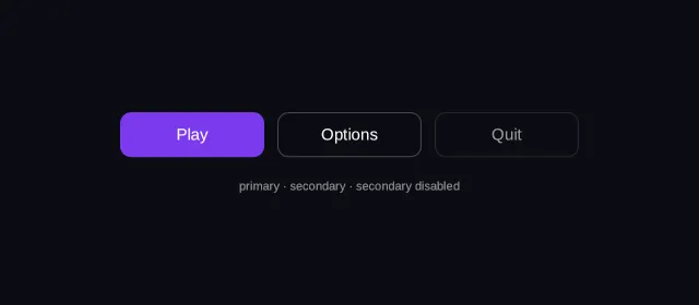
Play row is a Button carrying the named action
"play", and when it is pressed the game hears that word and nothing else. It
never learns what the button looked like, and the button never learns what the
game did about it.
- hover — off
- pressed — off
- focused — off
- selected — off
- disabled — off
Reported from the last painted frame
Not running — press Run to draw this on the GPU.
import { Button, Column, Row, Text } from "@zabloo/react";

export default function ButtonVariants() {
  return (
    <Column
      layout={{
        grow: 1,
        justify: "center",
        align: "center",
        gap: "{space.5}",
        padding: "{space.6}",
      }}
      style={{ background: "{color.bg}" }}
    >
      <Row layout={{ gap: "{space.3}", align: "center" }}>
        <Button
          variant="primary"
          onClick="play"
          layout={{ padding: "{space.3}", width: 132, justify: "center", align: "center" }}
        >
          <Text style={{ color: "{color.on-brand}", fontSize: "{text.md}" }}>Play</Text>
        </Button>

        <Button
          variant="secondary"
          onClick="options"
          layout={{ padding: "{space.3}", width: 132, justify: "center", align: "center" }}
        >
          <Text style={{ color: "{color.text}", fontSize: "{text.md}" }}>Options</Text>
        </Button>

        <Button
          variant="secondary"
          disabled
          onClick="quit"
          layout={{ padding: "{space.3}", width: 132, justify: "center", align: "center" }}
        >
          <Text style={{ color: "{color.text}", fontSize: "{text.md}" }}>Quit</Text>
        </Button>
      </Row>

      <Text style={{ color: "{color.faint}", fontSize: "{text.xs}" }}>
        primary · secondary · secondary disabled
      </Text>
    </Column>
  );
}
{
"v": 1,
"tokens": {
"color.bg": "#0b0d13",
"color.surface": "#0e1016",
"color.raised": "#14141a",
"color.line": "#ffffff1f",
"color.line-strong": "#ffffff24",
"color.text": "#ffffff",
"color.muted": "#a1a1aa",
"color.faint": "#8a8a93",
"color.on-brand": "#ffffff",
"color.brand": "#8b5cf6",
"color.brand-strong": "#7c3aed",
"color.brand-hover": "#8b5cf6",
"color.brand-pressed": "#6d28d9",
"color.brand-soft": "#8b5cf61f",
"color.gold": "#fcd34d",
"color.slot": "#ffffff08",
"color.danger": "#f87171",
"radius.sm": 6,
"radius.md": 10,
"radius.lg": 14,
"radius.pill": 999,
"border.hairline": 1,
"border.focus": 2,
"space.1": 4,
"space.2": 8,
"space.3": 12,
"space.4": 16,
"space.5": 20,
"space.6": 24,
"text.xs": 11,
"text.sm": 13,
"text.md": 15,
"text.lg": 17,
"motion.fast": 120,
"motion.loop": 900
},
"views": {
"button-variants": {
"type": "Container",
"layout": {
"direction": "column",
"grow": 1,
"justify": "center",
"align": "center",
"gap": "{space.5}",
"padding": "{space.6}"
},
"style": {
"background": "{color.bg}"
},
"children": [
{
"type": "Container",
"layout": {
"direction": "row",
"gap": "{space.3}",
"align": "center"
},
"children": [
{
"type": "Button",
"layout": {
"padding": "{space.3}",
"width": 132,
"justify": "center",
"align": "center"
},
"style": {
"background": "{color.brand-strong}",
"radius": "{radius.md}",
"color": "{color.on-brand}"
},
"states": {
"hover": {
"style": {
"background": "{color.brand-hover}"
}
},
"pressed": {
"style": {
"background": "{color.brand-pressed}"
}
},
"focused": {
"style": {
"borderWidth": "{border.focus}",
"borderColor": "{color.brand}"
}
},
"disabled": {
"style": {
"opacity": 0.45
}
}
},
"transition": {
"duration": "{motion.fast}"
},
"onClick": "play",
"children": [
{
"type": "Text",
"style": {
"color": "{color.on-brand}",
"fontSize": "{text.md}"
},
"text": "Play"
}
]
},
{
"type": "Button",
"layout": {
"padding": "{space.3}",
"width": 132,
"justify": "center",
"align": "center"
},
"style": {
"background": "#00000000",
"borderWidth": "{border.hairline}",
"borderColor": "{color.line-strong}",
"radius": "{radius.md}",
"color": "{color.text}"
},
"states": {
"hover": {
"style": {
"background": "{color.slot}"
}
},
"pressed": {
"style": {
"background": "{color.brand-soft}"
}
},
"focused": {
"style": {
"borderWidth": "{border.focus}",
"borderColor": "{color.brand}"
}
},
"disabled": {
"style": {
"opacity": 0.45
}
}
},
"transition": {
"duration": "{motion.fast}"
},
"onClick": "options",
"children": [
{
"type": "Text",
"style": {
"color": "{color.text}",
"fontSize": "{text.md}"
},
"text": "Options"
}
]
},
{
"type": "Button",
"disabled": true,
"layout": {
"padding": "{space.3}",
"width": 132,
"justify": "center",
"align": "center"
},
"style": {
"background": "#00000000",
"borderWidth": "{border.hairline}",
"borderColor": "{color.line-strong}",
"radius": "{radius.md}",
"color": "{color.text}"
},
"states": {
"hover": {
"style": {
"background": "{color.slot}"
}
},
"pressed": {
"style": {
"background": "{color.brand-soft}"
}
},
"focused": {
"style": {
"borderWidth": "{border.focus}",
"borderColor": "{color.brand}"
}
},
"disabled": {
"style": {
"opacity": 0.45
}
}
},
"transition": {
"duration": "{motion.fast}"
},
"onClick": "quit",
"children": [
{
"type": "Text",
"style": {
"color": "{color.text}",
"fontSize": "{text.md}"
},
"text": "Quit"
}
]
}
]
},
{
"type": "Text",
"style": {
"color": "{color.faint}",
"fontSize": "{text.xs}"
},
"text": "primary · secondary · secondary disabled"
}
]
}
}
}The props come in two tables because there are two layers, and the difference is
this product’s whole mental model: variant="primary" is a word you write, and
the theme resolves it into a style set before anything is exported. A game
receiving the envelope has no idea a variant was ever
involved.
Authoring props
What you write in @zabloo/react.
| Prop | Type | Default | Description |
|---|---|---|---|
| onClick | string | absent | Named action the game subscribes to. |
| children | ReactNode | absent | Button content. |
On top of these, every component takes the node base props — id, visible,
disabled, layout, style, states, transition, autofocus, clip —
plus variant, which the theme resolves away at export time and which never
appears in the IR.
IR props
What ships to the game, after the authoring layer is gone.
| Prop | Type | Default | Description |
|---|---|---|---|
| onClick | string | absent | Named action, fired on activation. |
| children | ZNode[] | [] | Ordinary flow children — a label, an icon, a row of both. |
Its content is its children, laid out by the ordinary flex pass. A button with an icon and a
text is a Button holding a Row — not a Button with an icon prop, which is why there is
no limit on what a button can hold.
Behavior
- States
The player moves onto it and it wears
hover; holds it down and it wearspressed; reaches it with the keyboard or the pad and it wearsfocused. As the chosen button of an"exclusive-select"group — a tab — it wearsselected. Anddisabled, its own or inherited from a section that switches off a whole group of controls at once. The game hears none of this: a state is what the button looks like, never a message.- Focusable
Yes, so the keyboard and the gamepad can reach it.
disabledtakes it out of the navigation, which puts itsonClickout of reach too: a control the player cannot get to cannot fire.- Activation
The player taps it, presses Enter while it is focused, or presses gamepad A → the button activates →
onClickfires. A press that ends outside the control cancels instead, and nothing is sent: dragging off a button is how a player takes a press back, and a pad that disconnects mid-press is treated the same way.- Actions
onClick, one name, fired after the activation completes. Inside aRepeatitem it arrives with an action context that says which element it fired from.
Degradation
On an older SDK the label still shows — but pressing it does nothing.
A Button an SDK does not know falls back to a Container: the content survives, the press is gone. Button has existed since v1, so in practice this only matters for props added later — but the rule is the same one every node follows, and it is why content newer than the SDK receiving it is a normal case rather than a crash.
Play
Play
How the game hears this
The button fires the name; the game decides what it means. That is the whole contract: the game never learns what drew the button, the button never learns what the game did about it, and neither side has to be rebuilt when the other changes. It is why a screen can be republished without touching the build a player already has.
using UnityEngine;
using Zabloo;

[RequireComponent(typeof(ZablooDocument))]
public sealed class MainMenu : MonoBehaviour
{
  ZablooDocument _doc;

  // Start, not OnEnable: it runs after ZablooDocument has built the view.
  void Start()
  {
      _doc = GetComponent<ZablooDocument>();
      _doc.OnAction += OnZablooAction;
  }

  void OnDestroy()
  {
      if (_doc != null) _doc.OnAction -= OnZablooAction;
  }

  void OnZablooAction(string action)
  {
      if (action == "play") StartGame();
      if (action == "options") OpenOptions();
  }
}
When the action fires from inside a Repeat item it carries an action context — the item's path, key and index — so the game can tell which row was pressed. The context is part of the format and the browser renderer delivers it; Unity's OnAction is Action<string> today and hands over the name alone, so a Unity game that needs the row reads it from its own state until that lands.
Composition
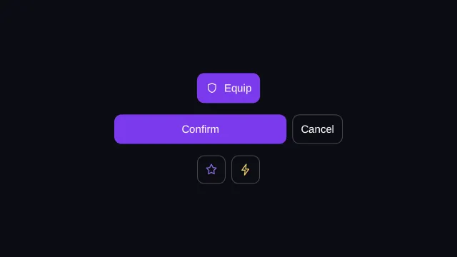
Because a button’s content is just children, everything a button can look like is a layout question rather than a prop:
- An icon before a label — use a
Rowinside the button when the icon is reinforcing the word, not replacing it. - A wide button beside a narrow one — put
growon the one that should take the leftover space, when a confirm should read as the heavier of a pair. - An icon-only button — a
Buttonwhose only child is anImage, for a toolbar where the meaning is already obvious from the picture.
- hover — off
- pressed — off
- focused — off
- selected — off
- disabled — off
Reported from the last painted frame
Not running — press Run to draw this on the GPU.
import { Button, Column, Image, Row, Text } from "@zabloo/react";

export default function ButtonComposition() {
  return (
    <Column
      layout={{
        grow: 1,
        justify: "center",
        align: "center",
        gap: "{space.4}",
        padding: "{space.6}",
      }}
      style={{ background: "{color.bg}" }}
    >
      {/* Icon + label: a Row inside the button. */}
      <Button variant="primary" onClick="equip" layout={{ padding: "{space.3}" }}>
        <Row layout={{ gap: "{space.2}", align: "center" }}>
          <Image
            src="icons/shield.png"
            layout={{ width: 18, height: 18 }}
            style={{ color: "{color.on-brand}" }}
          />
          <Text style={{ color: "{color.on-brand}", fontSize: "{text.md}" }}>Equip</Text>
        </Row>
      </Button>

      {/* A pair sharing a line: `grow` gives the primary the leftover space. */}
      <Row layout={{ gap: "{space.2}", width: 320 }}>
        <Button
          variant="primary"
          onClick="confirm"
          layout={{ grow: 1, padding: "{space.3}", justify: "center", align: "center" }}
        >
          <Text style={{ color: "{color.on-brand}", fontSize: "{text.md}" }}>Confirm</Text>
        </Button>
        <Button variant="secondary" onClick="cancel" layout={{ padding: "{space.3}" }}>
          <Text style={{ color: "{color.text}", fontSize: "{text.md}" }}>Cancel</Text>
        </Button>
      </Row>

      {/* Icon only: the accessible name is the game's business, not the IR's. */}
      <Row layout={{ gap: "{space.2}" }}>
        <Button
          variant="secondary"
          onClick="favorite"
          layout={{
            padding: "{space.2}",
            width: 40,
            height: 40,
            justify: "center",
            align: "center",
          }}
        >
          <Image
            src="icons/star.png"
            layout={{ width: 18, height: 18 }}
            style={{ color: "{color.brand}" }}
          />
        </Button>
        <Button
          variant="secondary"
          onClick="charge"
          layout={{
            padding: "{space.2}",
            width: 40,
            height: 40,
            justify: "center",
            align: "center",
          }}
        >
          <Image
            src="icons/bolt.png"
            layout={{ width: 18, height: 18 }}
            style={{ color: "{color.gold}" }}
          />
        </Button>
      </Row>
    </Column>
  );
}
{
"v": 1,
"tokens": {
"color.bg": "#0b0d13",
"color.surface": "#0e1016",
"color.raised": "#14141a",
"color.line": "#ffffff1f",
"color.line-strong": "#ffffff24",
"color.text": "#ffffff",
"color.muted": "#a1a1aa",
"color.faint": "#8a8a93",
"color.on-brand": "#ffffff",
"color.brand": "#8b5cf6",
"color.brand-strong": "#7c3aed",
"color.brand-hover": "#8b5cf6",
"color.brand-pressed": "#6d28d9",
"color.brand-soft": "#8b5cf61f",
"color.gold": "#fcd34d",
"color.slot": "#ffffff08",
"color.danger": "#f87171",
"radius.sm": 6,
"radius.md": 10,
"radius.lg": 14,
"radius.pill": 999,
"border.hairline": 1,
"border.focus": 2,
"space.1": 4,
"space.2": 8,
"space.3": 12,
"space.4": 16,
"space.5": 20,
"space.6": 24,
"text.xs": 11,
"text.sm": 13,
"text.md": 15,
"text.lg": 17,
"motion.fast": 120,
"motion.loop": 900
},
"views": {
"button-composition": {
"type": "Container",
"layout": {
"direction": "column",
"grow": 1,
"justify": "center",
"align": "center",
"gap": "{space.4}",
"padding": "{space.6}"
},
"style": {
"background": "{color.bg}"
},
"children": [
{
"type": "Button",
"layout": {
"padding": "{space.3}"
},
"style": {
"background": "{color.brand-strong}",
"radius": "{radius.md}",
"color": "{color.on-brand}"
},
"states": {
"hover": {
"style": {
"background": "{color.brand-hover}"
}
},
"pressed": {
"style": {
"background": "{color.brand-pressed}"
}
},
"focused": {
"style": {
"borderWidth": "{border.focus}",
"borderColor": "{color.brand}"
}
},
"disabled": {
"style": {
"opacity": 0.45
}
}
},
"transition": {
"duration": "{motion.fast}"
},
"onClick": "equip",
"children": [
{
"type": "Container",
"layout": {
"direction": "row",
"gap": "{space.2}",
"align": "center"
},
"children": [
{
"type": "Image",
"layout": {
"width": 18,
"height": 18
},
"style": {
"color": "{color.on-brand}"
},
"src": "asset:icons/shield.png"
},
{
"type": "Text",
"style": {
"color": "{color.on-brand}",
"fontSize": "{text.md}"
},
"text": "Equip"
}
]
}
]
},
{
"type": "Container",
"layout": {
"direction": "row",
"gap": "{space.2}",
"width": 320
},
"children": [
{
"type": "Button",
"layout": {
"grow": 1,
"padding": "{space.3}",
"justify": "center",
"align": "center"
},
"style": {
"background": "{color.brand-strong}",
"radius": "{radius.md}",
"color": "{color.on-brand}"
},
"states": {
"hover": {
"style": {
"background": "{color.brand-hover}"
}
},
"pressed": {
"style": {
"background": "{color.brand-pressed}"
}
},
"focused": {
"style": {
"borderWidth": "{border.focus}",
"borderColor": "{color.brand}"
}
},
"disabled": {
"style": {
"opacity": 0.45
}
}
},
"transition": {
"duration": "{motion.fast}"
},
"onClick": "confirm",
"children": [
{
"type": "Text",
"style": {
"color": "{color.on-brand}",
"fontSize": "{text.md}"
},
"text": "Confirm"
}
]
},
{
"type": "Button",
"layout": {
"padding": "{space.3}"
},
"style": {
"background": "#00000000",
"borderWidth": "{border.hairline}",
"borderColor": "{color.line-strong}",
"radius": "{radius.md}",
"color": "{color.text}"
},
"states": {
"hover": {
"style": {
"background": "{color.slot}"
}
},
"pressed": {
"style": {
"background": "{color.brand-soft}"
}
},
"focused": {
"style": {
"borderWidth": "{border.focus}",
"borderColor": "{color.brand}"
}
},
"disabled": {
"style": {
"opacity": 0.45
}
}
},
"transition": {
"duration": "{motion.fast}"
},
"onClick": "cancel",
"children": [
{
"type": "Text",
"style": {
"color": "{color.text}",
"fontSize": "{text.md}"
},
"text": "Cancel"
}
]
}
]
},
{
"type": "Container",
"layout": {
"direction": "row",
"gap": "{space.2}"
},
"children": [
{
"type": "Button",
"layout": {
"padding": "{space.2}",
"width": 40,
"height": 40,
"justify": "center",
"align": "center"
},
"style": {
"background": "#00000000",
"borderWidth": "{border.hairline}",
"borderColor": "{color.line-strong}",
"radius": "{radius.md}",
"color": "{color.text}"
},
"states": {
"hover": {
"style": {
"background": "{color.slot}"
}
},
"pressed": {
"style": {
"background": "{color.brand-soft}"
}
},
"focused": {
"style": {
"borderWidth": "{border.focus}",
"borderColor": "{color.brand}"
}
},
"disabled": {
"style": {
"opacity": 0.45
}
}
},
"transition": {
"duration": "{motion.fast}"
},
"onClick": "favorite",
"children": [
{
"type": "Image",
"layout": {
"width": 18,
"height": 18
},
"style": {
"color": "{color.brand}"
},
"src": "asset:icons/star.png"
}
]
},
{
"type": "Button",
"layout": {
"padding": "{space.2}",
"width": 40,
"height": 40,
"justify": "center",
"align": "center"
},
"style": {
"background": "#00000000",
"borderWidth": "{border.hairline}",
"borderColor": "{color.line-strong}",
"radius": "{radius.md}",
"color": "{color.text}"
},
"states": {
"hover": {
"style": {
"background": "{color.slot}"
}
},
"pressed": {
"style": {
"background": "{color.brand-soft}"
}
},
"focused": {
"style": {
"borderWidth": "{border.focus}",
"borderColor": "{color.brand}"
}
},
"disabled": {
"style": {
"opacity": 0.45
}
}
},
"transition": {
"duration": "{motion.fast}"
},
"onClick": "charge",
"children": [
{
"type": "Image",
"layout": {
"width": 18,
"height": 18
},
"style": {
"color": "{color.gold}"
},
"src": "asset:icons/bolt.png"
}
]
}
]
}
]
}
},
"assets": {
"icons/bolt.png": {
"hash": "07ac2ea21678f0a21ac34d25f30670ee76b56b3ea8e7d1e98aea339505654adf",
"mime": "image/png",
"size": 599,
"width": 64,
"height": 64,
"data": "iVBORw0KGgoA… (599 bytes, base64)"
},
"icons/shield.png": {
"hash": "cf3786285ac535ea549843224e903d3c573b903faf4ad507ab572aca76895cdb",
"mime": "image/png",
"size": 573,
"width": 64,
"height": 64,
"data": "iVBORw0KGgoA… (573 bytes, base64)"
},
"icons/star.png": {
"hash": "02f69f8ed48938f7704d264cd732afec0762fd8fd654944876443c87ed3cb1bd",
"mime": "image/png",
"size": 689,
"width": 64,
"height": 64,
"data": "iVBORw0KGgoA… (689 bytes, base64)"
}
}
}A button is also the natural anchor of a popover: an Overlay anchored to
its id with trigger: "press" opens on the same press that fires onClick.
Opening is behavior; it never replaces the declared action.
Inside a Repeat item, the same button appears once per element of the bound
array and its action carries the item it fired from — which is how onClick: "buy" can say which row was bought without the UI knowing anything about
shops.