 zabloo
TextInput
A line of text the player types into. It is the only node with a caret — an insertion point inside content that is being written.
primitivesince v1focusable
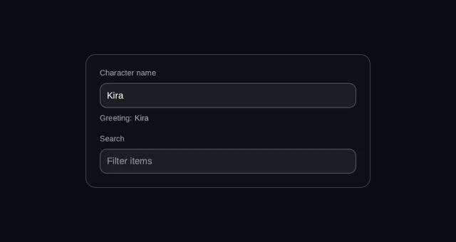
A TextInput is a line the player types into. You reach for one whenever the
game needs words it could not have offered as options: a character name, a search
box, a code to redeem. Picture a profile screen — the Name field writes every
keystroke straight into the game’s own data through its
binding, and Enter is a separate signal meaning accept it.
In v1 it is a single line, and it does not grow with what is typed into it.
- hover — off
- pressed — off
- focused — off
- selected — off
- disabled — off
Reported from the last painted frame
Not running — press Run to draw this on the GPU.
import { Column, Row, Text, TextInput } from "@zabloo/react";


const FIELD = {
  background: "{color.slot}",
  radius: "{radius.md}",
  borderWidth: "{border.hairline}",
  borderColor: "{color.line-strong}",
  color: "{color.text}",
  fontSize: "{text.sm}",
} as const;

/** The focus ring lives in `states`, like every other visual answer to input. */
const FIELD_STATES = {
  focused: { style: { borderWidth: "{border.focus}", borderColor: "{color.brand}" } },
  empty: { style: { color: "{color.faint}" } },
} as const;

export default function TextInputField() {
  return (
    <Column
      layout={{ grow: 1, justify: "center", align: "center", padding: "{space.6}" }}
      style={{ background: "{color.bg}" }}
    >
      <Column
        id="panel"
        layout={{ width: 400, padding: "{space.5}", gap: "{space.4}", align: "stretch" }}
        style={{
          background: "{color.surface}",
          radius: "{radius.lg}",
          borderWidth: "{border.hairline}",
          borderColor: "{color.line}",
        }}
      >
        <Column layout={{ gap: "{space.2}", align: "stretch" }}>
          <Text style={{ color: "{color.faint}", fontSize: "{text.xs}" }}>Character name</Text>
          {/* maxLength bounds what the PLAYER can type; a longer string pushed
              by the game is still shown whole. */}
          <TextInput
            id="name"
            value={{ bind: "profile.name" }}
            placeholder="Your name"
            maxLength={16}
            onSubmit="name-accept"
            width={360}
            padding={10}
            style={FIELD}
            states={FIELD_STATES}
          />
          <Row layout={{ gap: "{space.1}", align: "center" }}>
            <Text style={{ color: "{color.faint}", fontSize: "{text.xs}" }}>Greeting:</Text>
            {/* The same path, read. No callback, no game code. */}
            <Text bind="profile.name" style={{ color: "{color.muted}", fontSize: "{text.xs}" }} />
          </Row>
        </Column>

        <Column layout={{ gap: "{space.2}", align: "stretch" }}>
          <Text style={{ color: "{color.faint}", fontSize: "{text.xs}" }}>Search</Text>
          {/* Empty, so `states.empty` is what paints the placeholder — and
              `onChange` is the live hook a filter-as-you-type hangs off. */}
          <TextInput
            id="search"
            value={{ bind: "search.query" }}
            placeholder="Filter items"
            onChange="search-typed"
            onSubmit="search-run"
            width={360}
            padding={10}
            style={FIELD}
            states={FIELD_STATES}
          />
        </Column>
      </Column>
    </Column>
  );
}
{
"v": 1,
"tokens": {
"color.bg": "#0b0d13",
"color.surface": "#0e1016",
"color.raised": "#14141a",
"color.line": "#ffffff1f",
"color.line-strong": "#ffffff24",
"color.text": "#ffffff",
"color.muted": "#a1a1aa",
"color.faint": "#8a8a93",
"color.on-brand": "#ffffff",
"color.brand": "#8b5cf6",
"color.brand-strong": "#7c3aed",
"color.brand-hover": "#8b5cf6",
"color.brand-pressed": "#6d28d9",
"color.brand-soft": "#8b5cf61f",
"color.gold": "#fcd34d",
"color.slot": "#ffffff08",
"color.danger": "#f87171",
"radius.sm": 6,
"radius.md": 10,
"radius.lg": 14,
"radius.pill": 999,
"border.hairline": 1,
"border.focus": 2,
"space.1": 4,
"space.2": 8,
"space.3": 12,
"space.4": 16,
"space.5": 20,
"space.6": 24,
"text.xs": 11,
"text.sm": 13,
"text.md": 15,
"text.lg": 17,
"motion.fast": 120,
"motion.loop": 900
},
"views": {
"textinput-field": {
"type": "Container",
"layout": {
"direction": "column",
"grow": 1,
"justify": "center",
"align": "center",
"padding": "{space.6}"
},
"style": {
"background": "{color.bg}"
},
"children": [
{
"type": "Container",
"id": "panel",
"layout": {
"direction": "column",
"width": 400,
"padding": "{space.5}",
"gap": "{space.4}",
"align": "stretch"
},
"style": {
"background": "{color.surface}",
"radius": "{radius.lg}",
"borderWidth": "{border.hairline}",
"borderColor": "{color.line}"
},
"children": [
{
"type": "Container",
"layout": {
"direction": "column",
"gap": "{space.2}",
"align": "stretch"
},
"children": [
{
"type": "Text",
"style": {
"color": "{color.faint}",
"fontSize": "{text.xs}"
},
"text": "Character name"
},
{
"type": "TextInput",
"id": "name",
"layout": {
"width": 360,
"padding": 10
},
"style": {
"background": "{color.slot}",
"radius": "{radius.md}",
"color": "{color.text}",
"borderWidth": "{border.hairline}",
"borderColor": "{color.line-strong}",
"fontSize": "{text.sm}"
},
"states": {
"focused": {
"style": {
"borderWidth": "{border.focus}",
"borderColor": "{color.brand}"
}
},
"empty": {
"style": {
"color": "{color.faint}"
}
}
},
"value": {
"bind": "profile.name"
},
"placeholder": "Your name",
"onSubmit": "name-accept",
"maxLength": 16
},
{
"type": "Container",
"layout": {
"direction": "row",
"gap": "{space.1}",
"align": "center"
},
"children": [
{
"type": "Text",
"style": {
"color": "{color.faint}",
"fontSize": "{text.xs}"
},
"text": "Greeting:"
},
{
"type": "Text",
"style": {
"color": "{color.muted}",
"fontSize": "{text.xs}"
},
"text": {
"bind": "profile.name"
}
}
]
}
]
},
{
"type": "Container",
"layout": {
"direction": "column",
"gap": "{space.2}",
"align": "stretch"
},
"children": [
{
"type": "Text",
"style": {
"color": "{color.faint}",
"fontSize": "{text.xs}"
},
"text": "Search"
},
{
"type": "TextInput",
"id": "search",
"layout": {
"width": 360,
"padding": 10
},
"style": {
"background": "{color.slot}",
"radius": "{radius.md}",
"color": "{color.text}",
"borderWidth": "{border.hairline}",
"borderColor": "{color.line-strong}",
"fontSize": "{text.sm}"
},
"states": {
"focused": {
"style": {
"borderWidth": "{border.focus}",
"borderColor": "{color.brand}"
}
},
"empty": {
"style": {
"color": "{color.faint}"
}
}
},
"value": {
"bind": "search.query"
},
"placeholder": "Filter items",
"onChange": "search-typed",
"onSubmit": "search-run"
}
]
}
]
}
]
}
}
}Every control before this one produced a value by pointing at geometry — a
boolean, a number, an index. This one has a position inside itself, and that
is what makes it a type rather than a Text with a flag.
The two tables below differ by only a couple of rows, and both are conveniences:
width and padding are numbers you write that resolve into the node’s ordinary
layout before anything ships. What arrives at the game is a field, its text,
and the two names it can fire.
Authoring props
What you write in @zabloo/react.
| Prop | Type | Default | Description |
|---|---|---|---|
| value | Bindable<string> | "" | Current text, or a read/write binding. |
| placeholder | string | absent | Hint shown while the field is empty. |
| onChange / onSubmit | string | absent | The live hook and the confirm hook. |
| maxLength | number | unbounded | Cap on what the player can type. |
| width | number | 220 | Field width along its line, in px. |
| padding | number | 8 | Space between the box and the text, in px. |
On top of these, every component takes the node base props — id, visible,
disabled, layout, style, states, transition, autofocus, clip —
plus variant, which the theme resolves away at export time and which never
appears in the IR. A field does not resize with what is typed into it, so it
needs a width of its own; an explicit layout still wins, and grow: 1 fills a
row.
IR props
What ships to the game, after the authoring layer is gone.
| Prop | Type | Default | Description |
|---|---|---|---|
| value | Bindable<string> | "" | Current text, or a read/write binding. |
| placeholder | string | absent | Shown while the value is empty. |
| onChange | string | absent | Named action fired after every edit. |
| onSubmit | string | absent | Named action fired when the player confirms (Enter). |
| maxLength | number | unbounded | Cap on what the player can type. |
A content-bearing leaf, like Text and Image: it takes no children and
paints its own value through the ordinary text path.
Value
value is either a literal initial string or a read/write binding: the SDK
writes every change into its data store and notifies the game. A <Text bind> on
the same path follows what is typed, with no game code in between — the fixture
above is exactly that.
maxLength bounds input, not data. A longer string pushed by the game
through a binding is shown whole: silently truncating the game’s own data would
be a lie about what it holds.
Two hooks, and one that does not exist
onChangefires on every edit — the live hook, symmetric withSlider.onChange. A search that filters as you type hangs here.onSubmitfires when the player confirms the field: the search that runs, the name that is accepted.
Unlike a drag, a text field already has an explicit confirming gesture — Enter — so the live/settled pair exists; only the second hook’s name differs, and it differs because the gesture does. Submit is something the player does, while a slider’s commit is something they stop doing. Commit-on-blur would not survive a game anyway: with arrow and gamepad navigation the focus leaves the field every time the player crosses it, so a blur commit would fire spurious “settled” values — and a bound field has already written every edit into the data, so nothing is lost by leaving.
Single line in v1
The node measures as one line of text and scrolls its content horizontally to keep the caret visible. A newline is never inserted; a pasted one becomes a space. The multiline field is a compatible extension over the wrap algorithm — a caret with a row as well as a column, and a selection across lines — and is deferred.
Placeholder
placeholder is painted in the field’s own text style while the value is
empty, and the empty state is what styles it:
"states": { "empty": { "style": { "color": "{color.muted}" } } }No second colour field and no slot: the node already owns the text paint, so a
placeholder is that same paint with another string. empty opens the merge order
— it is the weakest thing a control says about its value, so anything declared
for a focused or selected field wins over it.
Behavior
- States
empty, plushoverandfocused— anddisabled, its own or inherited. There is nopressed: a press on a field places the caret, it does not activate anything, so there is no down-state to dress. A disabled field takes no caret and no keystroke, and still shows what it holds.- Focusable
Yes, unless
disabled. It takes the arrow keys to move its caret but gives them back at the extremes: at the end of the text, one more press leaves the field. Deliberately unlike theSlider, which never releases the arrows on its axis — walking out of a long string one keypress at a time is not a reasonable price.- Painting
The caret and the selection highlight are painted by the SDK, both from the field’s own
style.color— the same “color of this node’s content” that tints glyphs and images. Their blink and their styling are behavior, not IR: the same split that keeps theScrollView’s scrollbar out of the format.- Actions
The player types a character → the SDK writes the new string into the data →
onChangefires. The player presses Enter → nothing changes in the text →onSubmitfires on its own. From the other direction,SetText(id, text)replaces the buffer and leaves the caret at the end, where someone handed a prefilled value would start typing.
Degradation
On an older SDK the field's box shows at its exact size and nothing else: no text inside it, and nothing can be typed.
As an empty Container: a leaf, so what survives is the box — its background, its border, its size. The layout does not move, because a field's size was never a function of its content.
How the game hears this
The binding is the text; the action is the moment the player confirmed it.
This is where the two channels are easiest to tell apart. Every edit is written
into the data store as it happens, so the game’s copy is never stale; the action
carries no text at all, only the news that Enter was pressed. A name field that
matters only once accepted subscribes to onSubmit alone and never looks at the
keystrokes.
using UnityEngine;
using Zabloo;

[RequireComponent(typeof(ZablooDocument))]
public sealed class ProfileScreen : MonoBehaviour
{
  ZablooDocument _doc;

  void Start()
  {
      _doc = GetComponent<ZablooDocument>();
      _doc.OnAction += OnZablooAction;

      // The field starts on what the game holds — the same path it writes back.
      _doc.SetData("profile.name", SaveGame.PlayerName);
  }

  void OnDestroy()
  {
      if (_doc != null) _doc.OnAction -= OnZablooAction;
  }

  void OnZablooAction(string action)
  {
      // Enter, not every keystroke: this is the gesture that means "accept it".
      if (action == "name-accept") CommitPlayerName();
  }
}
Composition
A field plus a Text bound to the same path is the whole “live preview”
pattern, and it needs no code.
- The canonical field — bound, capped and confirmed with Enter; use this shape for anything the player names.
- A field with a
Texton the same path — use it when the value should be visible somewhere else on the screen as it is typed. - A field with
grow: 1in aRow— use it for a search bar, where the field should take whatever width the button beside it leaves.
// The canonical field: bound, capped, confirmed with Enter.
<TextInput
value={{ bind: "profile.name" }}
placeholder="Your name"
maxLength={16}
onSubmit="name-accept"
states={{ empty: { style: { color: "{color.muted}" } } }}
/>

// A live preview of what is being typed. No callback in between.
<Text bind="profile.name" />

// A search bar: the field takes the leftover space, the button keeps its size.
<Row layout={{ gap: 8, align: "center" }}>
<TextInput value={{ bind: "search.query" }} onChange="search-typed" layout={{ grow: 1 }} />
<Button onClick="search-run"><Text>Search</Text></Button>
</Row>