 zabloo
Text
The node that shows words. It holds one string — written by you, or read live from data the game owns — and measures itself from the glyphs it draws.
primitivesince v1not focusable
A Text shows a string, and that is all it does. It takes no children — what
it is given is one run of words, measured from the glyphs themselves and then
laid out like any other box. You reach for one for every word on a screen: a
button’s label, a quest title, the number on a gold counter. That last one is
worth picturing, because it is where the node earns its keep: give it a
binding — bind="player.gold" — and it reads a number
the game owns, so the counter follows the gold with no code in between.
Viewport: 960 × 340
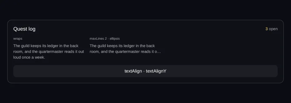
- hover — off
- pressed — off
- focused — off
- selected — off
- disabled — off
Reported from the last painted frame
Not running — press Run to draw this on the GPU.
import { Column, Row, Text } from "@zabloo/react";


const LORE =
  "The guild keeps its ledger in the back room, and the quartermaster reads it out loud once a week.";

const COLUMN_WIDTH = 236;

export default function TextWrap() {
  return (
    <Column
      // `align: "stretch"` on the ROOT is what hands the panel the view's own
      // width; centring it instead would pin the panel to its content and no
      // change of viewport could reach it (ZAB-153).
      layout={{ grow: 1, justify: "center", align: "stretch", padding: "{space.6}" }}
      style={{ background: "{color.bg}" }}
    >
      <Column
        id="panel"
        layout={{ padding: "{space.5}", gap: "{space.4}", align: "stretch" }}
        style={{
          background: "{color.surface}",
          radius: "{radius.lg}",
          borderWidth: "{border.hairline}",
          borderColor: "{color.line}",
        }}
      >
        {/* A bound Text shows the value as it is: there is no formatting at
            runtime, so the game composes the string before it calls SetData. */}
        <Row layout={{ justify: "space-between", align: "center" }}>
          <Text style={{ color: "{color.text}", fontSize: "{text.lg}" }}>Quest log</Text>
          <Row layout={{ gap: "{space.1}", align: "center" }}>
            <Text bind="quest.count" style={{ color: "{color.gold}", fontSize: "{text.sm}" }} />
            <Text style={{ color: "{color.faint}", fontSize: "{text.sm}" }}>open</Text>
          </Row>
        </Row>

        {/* The two columns keep their width at every viewport, and that is the
            point of THIS fixture: the comparison only holds while both are
            measured against the same width. What the viewport changes is
            whether they fit side by side — 236 + 16 + 236 clears a desktop and
            not a phone, so on a phone the second drops under the first
            (ZAB-153). Growing them instead would widen the paragraph until it
            no longer needed a third line, and the truncated twin would have
            nothing left to truncate. */}
        <Row layout={{ wrap: true, gap: "{space.4}", align: "start" }}>
          <Column layout={{ width: COLUMN_WIDTH, gap: "{space.2}", align: "stretch" }}>
            <Text style={{ color: "{color.faint}", fontSize: "{text.xs}" }}>wraps</Text>
            {/* No `maxLines`: the greedy first-fit pass breaks at spaces and
                uses as many lines as the width needs. */}
            <Text style={{ color: "{color.muted}", fontSize: "{text.sm}", lineHeight: 19 }}>
              {LORE}
            </Text>
          </Column>

          <Column layout={{ width: COLUMN_WIDTH, gap: "{space.2}", align: "stretch" }}>
            <Text style={{ color: "{color.faint}", fontSize: "{text.xs}" }}>
              maxLines 2 · ellipsis
            </Text>
            {/* Same string, same width. Lines past the cap are dropped and the
                last one keeps glyphs until the … fits. */}
            <Text
              style={{
                color: "{color.muted}",
                fontSize: "{text.sm}",
                lineHeight: 19,
                maxLines: 2,
                overflow: "ellipsis",
              }}
            >
              {LORE}
            </Text>
          </Column>
        </Row>

        {/* Centred on its own rect, and vertically centred inside it: both are
            style, so a theme or a state can override either. */}
        <Text
          layout={{ height: 40 }}
          style={{
            color: "{color.text}",
            fontSize: "{text.md}",
            textAlign: "center",
            textAlignY: "center",
            background: "{color.slot}",
            radius: "{radius.md}",
          }}
        >
          textAlign · textAlignY
        </Text>
      </Column>
    </Column>
  );
}
{
"v": 1,
"tokens": {
"color.bg": "#0b0d13",
"color.surface": "#0e1016",
"color.raised": "#14141a",
"color.line": "#ffffff1f",
"color.line-strong": "#ffffff24",
"color.text": "#ffffff",
"color.muted": "#a1a1aa",
"color.faint": "#8a8a93",
"color.on-brand": "#ffffff",
"color.brand": "#8b5cf6",
"color.brand-strong": "#7c3aed",
"color.brand-hover": "#8b5cf6",
"color.brand-pressed": "#6d28d9",
"color.brand-soft": "#8b5cf61f",
"color.gold": "#fcd34d",
"color.slot": "#ffffff08",
"color.danger": "#f87171",
"radius.sm": 6,
"radius.md": 10,
"radius.lg": 14,
"radius.pill": 999,
"border.hairline": 1,
"border.focus": 2,
"space.1": 4,
"space.2": 8,
"space.3": 12,
"space.4": 16,
"space.5": 20,
"space.6": 24,
"text.xs": 11,
"text.sm": 13,
"text.md": 15,
"text.lg": 17,
"motion.fast": 120,
"motion.loop": 900
},
"views": {
"text-wrap": {
"type": "Container",
"layout": {
"direction": "column",
"grow": 1,
"justify": "center",
"align": "stretch",
"padding": "{space.6}"
},
"style": {
"background": "{color.bg}"
},
"children": [
{
"type": "Container",
"id": "panel",
"layout": {
"direction": "column",
"padding": "{space.5}",
"gap": "{space.4}",
"align": "stretch"
},
"style": {
"background": "{color.surface}",
"radius": "{radius.lg}",
"borderWidth": "{border.hairline}",
"borderColor": "{color.line}"
},
"children": [
{
"type": "Container",
"layout": {
"direction": "row",
"justify": "space-between",
"align": "center"
},
"children": [
{
"type": "Text",
"style": {
"color": "{color.text}",
"fontSize": "{text.lg}"
},
"text": "Quest log"
},
{
"type": "Container",
"layout": {
"direction": "row",
"gap": "{space.1}",
"align": "center"
},
"children": [
{
"type": "Text",
"style": {
"color": "{color.gold}",
"fontSize": "{text.sm}"
},
"text": {
"bind": "quest.count"
}
},
{
"type": "Text",
"style": {
"color": "{color.faint}",
"fontSize": "{text.sm}"
},
"text": "open"
}
]
}
]
},
{
"type": "Container",
"layout": {
"direction": "row",
"wrap": true,
"gap": "{space.4}",
"align": "start"
},
"children": [
{
"type": "Container",
"layout": {
"direction": "column",
"width": 236,
"gap": "{space.2}",
"align": "stretch"
},
"children": [
{
"type": "Text",
"style": {
"color": "{color.faint}",
"fontSize": "{text.xs}"
},
"text": "wraps"
},
{
"type": "Text",
"style": {
"color": "{color.muted}",
"fontSize": "{text.sm}",
"lineHeight": 19
},
"text": "The guild keeps its ledger in the back room, and the quartermaster reads it out loud once a week."
}
]
},
{
"type": "Container",
"layout": {
"direction": "column",
"width": 236,
"gap": "{space.2}",
"align": "stretch"
},
"children": [
{
"type": "Text",
"style": {
"color": "{color.faint}",
"fontSize": "{text.xs}"
},
"text": "maxLines 2 · ellipsis"
},
{
"type": "Text",
"style": {
"color": "{color.muted}",
"fontSize": "{text.sm}",
"lineHeight": 19,
"maxLines": 2,
"overflow": "ellipsis"
},
"text": "The guild keeps its ledger in the back room, and the quartermaster reads it out loud once a week."
}
]
}
]
},
{
"type": "Text",
"layout": {
"height": 40
},
"style": {
"color": "{color.text}",
"fontSize": "{text.md}",
"textAlign": "center",
"textAlignY": "center",
"background": "{color.slot}",
"radius": "{radius.md}"
},
"text": "textAlign · textAlignY"
}
]
}
]
}
}
}Two tables below, and here the second is the shorter one. What you write accepts
either static children or a bind; what ships collapses both into a single
field, because by then the difference has stopped mattering — the node has
content, and where the content came from was the author’s business.
Authoring props
What you write in @zabloo/react.
| Prop | Type | Default | Description |
|---|---|---|---|
| children | string | number | Array<string | number> | — | Static content. Adjacent strings and numbers are joined at authoring time. |
| bind | string | absent | Data path. Mutually exclusive with children. |
On top of these, every component takes the node base props — id, visible,
disabled, layout, style, states, transition, autofocus, clip —
plus variant, which the theme resolves away at export time and which never
appears in the IR.
IR props
What ships to the game, after the authoring layer is gone.
| Prop | Type | Default | Description |
|---|---|---|---|
| text | Bindable<string> | — | The content, literal or bound. "" is valid content. |
One prop, and everything else about a Text is style:
color, fontSize, textAlign, textAlignY, lineHeight, wrap, overflow,
maxLines. There are no Text-specific layout props — which is exactly what
lets a variant theme a label and a state override it, like any other visual
input.
"" is what a label with nothing to say looks like — a dropdown before a value is chosen, a
counter at zero, a path the game has not filled in yet — so the node loads and paints like any
other, and keeps its height. The field being absent is what makes the node unloadable: the
reader drops it with invalid-node, because a Text that was never given content is a tree
nobody meant to author.
Behavior
- States
disabledonly, inherited from whatever declared it — which is what lets the label of a switched-off section dim along with the controls it names.- Focusable
No. Nothing the player does reaches a
Text: it never hovers and takes no input, so nostates.*beyonddisabledapplies, and there is nothing here the game can hear.- Glyphs
Self-rendered: the SDK rasterizes glyphs from a TTF into its own atlas and draws them as quads, with no engine text element involved. The font is fixed in v1 — every target embeds the same typeface, which is what makes the break algorithm below verifiable rather than delegated.
fontSizesnaps (it is the atlas key, so a transition never tweens it) and is clamped to1..512.- Actions
None. A word the player can press is a
Textinside aButton.
Text layout
Break points have to be identical on every target, so the algorithm is specified rather than delegated: an SDK implements exactly this, not “whatever the platform’s text engine does”. The short version, in the order the pass runs:
- Available width is what the parent offers minus
padding. An explicitlayout.widthreplaces the offer for that subtree; a row and a column behave the same, since v1 measures no cross-child competition. AScrollViewoffers nothing on a scrollable axis, so text inside a horizontal scroller never wraps. - Hard breaks.
\r\nand\rnormalize to\n, which always breaks. An empty paragraph still produces a line. - Word wrap is greedy, first fit. The only break opportunities are runs of space and tab — a non-breaking space holds, and so does a hyphen. Spaces at a break are dropped; spaces that start a line count, so indentation survives. Every measurement includes kerning, and a break ends the chain.
- Long words that do not fit on a line of their own break between glyphs, at the last one that fits, with a minimum of one glyph per line.
- Truncation: lines past
maxLinesare dropped, thenoverflowcuts what is still too wide — withwrap: falseonly, since a wrapped line already fits.overflow: "ellipsis"marks the last kept line with…. - Placement. Block height is lines ×
lineHeight; each line’s baseline sits at half-leading, so raisinglineHeightnever pushes a single-lineTextoff centre.textAlignaligns each line by its own width;textAlignYaligns the block as a whole.
The text properties all snap like fontSize: a re-wrap has no meaningful
intermediate value, so none of them is animatable.
The empty Text
"" is one line — the same rule as the empty paragraph of step 2, applied to
the whole content — so an empty Text measures 0 × lineHeight and keeps its
height. It is not a special case; it is what the algorithm already says.
That is the behavior a layout needs. A row with a gap around a <Text> whose
binding goes blank keeps its slot instead of collapsing and shuffling its
siblings one gap to the left. The width is zero: an empty line paints
nothing, so nothing reserves horizontal room. A node that should disappear
entirely uses visible, which takes it out of layout, gap included.
Degradation
On an older SDK the box is still there at its size — the words inside it are not.
An SDK that did not know this type would render an empty Container: Text is a leaf, so there is no child content to preserve. The box, its background and its border survive; the glyphs do not. Text has existed since v1, so in practice this is the shape of the rule rather than a case you will meet.
Composition
A bound Text shows the value as it is. There is no formatting and no
interpolation at runtime: a game that wants 1,250 gold composes that string
before it calls SetData, and a game that wants two colours uses two nodes.
- A static label — use it for words the screen owns:
Buy,Settings, the title of a panel. - A bound label — use it for anything the game owns and changes: a gold count, a player name, a quest’s current step.
- A capped label — use
maxLinesandoverflowfor text of unknown length in a fixed slot, such as an item description in a shop row. - Two labels in a
Row— use this when one line needs two colours, because oneTextis one paint.
// Static, bound, and truncated.
<Text>Buy</Text>
<Text bind="player.gold" />
<Text style={{ maxLines: 2, overflow: "ellipsis", textAlign: "center" }}>
A long description that will be cut after two lines
</Text>

// Two nodes, because one Text is one paint. The Row is the composition.
<Row layout={{ gap: 4, align: "center" }}>
<Text bind="player.gold" style={{ color: "{color.gold}" }} />
<Text style={{ color: "{color.faint}" }}>gold</Text>
</Row>
<Text></Text> emits text: "" — a real node with a real slot, per the rule
above. Several components lean on it: a Select before a value is chosen, a
Badge with no count.