 zabloo
ProgressBar
A track that fills to a fraction the game sets. It is the read-only half of the pair a Slider completes: the player watches this one rather than moving it.
primitivesince v1not focusable
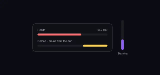
A ProgressBar is a track that fills to a fraction between 0 and 1. The game
sets that number and the player only reads it: health draining, a download
filling, a reload timer running out. Picture a HUD whose value is a
binding onto player.hp — every time the game calls
SetData, the bar follows. It earns its place as a node type because nothing
else in v1 can say a fraction of my parent: layout sizes are pixels, they
are not bindable, and grow is neither.
- hover — off
- pressed — off
- focused — off
- selected — off
- disabled — off
Reported from the last painted frame
Not running — press Run to draw this on the GPU.
import { Column, ProgressBar, Row, Text } from "@zabloo/react";


const TRACK = {
  background: "{color.slot}",
  radius: "{radius.pill}",
} as const;

export default function ProgressBarBars() {
  return (
    <Column
      layout={{ grow: 1, justify: "center", align: "center", padding: "{space.6}" }}
      style={{ background: "{color.bg}" }}
    >
      <Row layout={{ gap: "{space.5}", align: "center" }}>
        <Column
          id="panel"
          layout={{ width: 320, padding: "{space.5}", gap: "{space.4}", align: "stretch" }}
          style={{
            background: "{color.surface}",
            radius: "{radius.lg}",
            borderWidth: "{border.hairline}",
            borderColor: "{color.line}",
          }}
        >
          <Column layout={{ gap: "{space.2}", align: "stretch" }}>
            <Row layout={{ justify: "space-between", align: "center" }}>
              <Text style={{ color: "{color.muted}", fontSize: "{text.xs}" }}>Health</Text>
              <Text
                bind="player.hpLabel"
                style={{ color: "{color.faint}", fontSize: "{text.xs}" }}
              />
            </Row>
            <ProgressBar
              id="hp"
              value={{ bind: "player.hp" }}
              size={8}
              transition={{ duration: "{motion.fast}" }}
              style={TRACK}
              fill={{ background: "{color.danger}", radius: "{radius.pill}" }}
            />
          </Column>

          <Column layout={{ gap: "{space.2}", align: "stretch" }}>
            <Text style={{ color: "{color.muted}", fontSize: "{text.xs}" }}>
              Reload · drains from the end
            </Text>
            {/* `justify: "end"` anchors the fill at the other side, which is
                what a bar that empties looks like. */}
            <ProgressBar
              id="reload"
              value={{ bind: "weapon.reload" }}
              size={8}
              layout={{ justify: "end" }}
              style={TRACK}
              fill={{ background: "{color.gold}", radius: "{radius.pill}" }}
            />
          </Column>
        </Column>

        {/* A column bar: the same node, main axis turned. */}
        <Column layout={{ gap: "{space.2}", align: "center" }}>
          <ProgressBar
            id="stamina"
            value={{ bind: "player.stamina" }}
            layout={{ direction: "column", justify: "end", height: 120 }}
            size={10}
            style={TRACK}
            fill={{ background: "{color.brand}", radius: "{radius.pill}" }}
          />
          <Text style={{ color: "{color.faint}", fontSize: "{text.xs}" }}>Stamina</Text>
        </Column>
      </Row>
    </Column>
  );
}
{
"v": 1,
"tokens": {
"color.bg": "#0b0d13",
"color.surface": "#0e1016",
"color.raised": "#14141a",
"color.line": "#ffffff1f",
"color.line-strong": "#ffffff24",
"color.text": "#ffffff",
"color.muted": "#a1a1aa",
"color.faint": "#8a8a93",
"color.on-brand": "#ffffff",
"color.brand": "#8b5cf6",
"color.brand-strong": "#7c3aed",
"color.brand-hover": "#8b5cf6",
"color.brand-pressed": "#6d28d9",
"color.brand-soft": "#8b5cf61f",
"color.gold": "#fcd34d",
"color.slot": "#ffffff08",
"color.danger": "#f87171",
"radius.sm": 6,
"radius.md": 10,
"radius.lg": 14,
"radius.pill": 999,
"border.hairline": 1,
"border.focus": 2,
"space.1": 4,
"space.2": 8,
"space.3": 12,
"space.4": 16,
"space.5": 20,
"space.6": 24,
"text.xs": 11,
"text.sm": 13,
"text.md": 15,
"text.lg": 17,
"motion.fast": 120,
"motion.loop": 900
},
"views": {
"progressbar-bars": {
"type": "Container",
"layout": {
"direction": "column",
"grow": 1,
"justify": "center",
"align": "center",
"padding": "{space.6}"
},
"style": {
"background": "{color.bg}"
},
"children": [
{
"type": "Container",
"layout": {
"direction": "row",
"gap": "{space.5}",
"align": "center"
},
"children": [
{
"type": "Container",
"id": "panel",
"layout": {
"direction": "column",
"width": 320,
"padding": "{space.5}",
"gap": "{space.4}",
"align": "stretch"
},
"style": {
"background": "{color.surface}",
"radius": "{radius.lg}",
"borderWidth": "{border.hairline}",
"borderColor": "{color.line}"
},
"children": [
{
"type": "Container",
"layout": {
"direction": "column",
"gap": "{space.2}",
"align": "stretch"
},
"children": [
{
"type": "Container",
"layout": {
"direction": "row",
"justify": "space-between",
"align": "center"
},
"children": [
{
"type": "Text",
"style": {
"color": "{color.muted}",
"fontSize": "{text.xs}"
},
"text": "Health"
},
{
"type": "Text",
"style": {
"color": "{color.faint}",
"fontSize": "{text.xs}"
},
"text": {
"bind": "player.hpLabel"
}
}
]
},
{
"type": "ProgressBar",
"id": "hp",
"layout": {
"direction": "row",
"height": 8
},
"style": {
"background": "{color.slot}",
"radius": "{radius.pill}"
},
"transition": {
"duration": "{motion.fast}"
},
"clip": true,
"value": {
"bind": "player.hp"
},
"children": [
{
"type": "Container",
"style": {
"background": "{color.danger}",
"radius": "{radius.pill}"
}
}
]
}
]
},
{
"type": "Container",
"layout": {
"direction": "column",
"gap": "{space.2}",
"align": "stretch"
},
"children": [
{
"type": "Text",
"style": {
"color": "{color.muted}",
"fontSize": "{text.xs}"
},
"text": "Reload · drains from the end"
},
{
"type": "ProgressBar",
"id": "reload",
"layout": {
"direction": "row",
"height": 8,
"justify": "end"
},
"style": {
"background": "{color.slot}",
"radius": "{radius.pill}"
},
"clip": true,
"value": {
"bind": "weapon.reload"
},
"children": [
{
"type": "Container",
"style": {
"background": "{color.gold}",
"radius": "{radius.pill}"
}
}
]
}
]
}
]
},
{
"type": "Container",
"layout": {
"direction": "column",
"gap": "{space.2}",
"align": "center"
},
"children": [
{
"type": "ProgressBar",
"id": "stamina",
"layout": {
"direction": "column",
"width": 10,
"justify": "end",
"height": 120
},
"style": {
"background": "{color.slot}",
"radius": "{radius.pill}"
},
"clip": true,
"value": {
"bind": "player.stamina"
},
"children": [
{
"type": "Container",
"style": {
"background": "{color.brand}",
"radius": "{radius.pill}"
}
}
]
},
{
"type": "Text",
"style": {
"color": "{color.faint}",
"fontSize": "{text.xs}"
},
"text": "Stamina"
}
]
}
]
}
]
}
}
}The two tables below are further apart than their size suggests. size and
fill are conveniences you write: the thickness becomes ordinary layout, and
the fill’s style becomes the style of a real child node. Two props ship, and one
of them is a slot.
Authoring props
<ProgressBar> emits this node with the fill already built — there is no raw
export that would leave it to you, since the fill is children[0] by convention.
| Prop | Type | Default | Description |
|---|---|---|---|
| value | Bindable<number> | 0 | Progress in 0..1, usually a read binding. |
| fill | Style | absent | Style of the fill, merged over the default bar. |
| size | number | 8 | Bar thickness in px — height for a row bar, width for a column one. |
On top of these, every component takes the node base props — id, visible,
disabled, layout, style, states, transition, autofocus, clip —
plus variant, which the theme resolves away at export time and which never
appears in the IR. The component defaults to a horizontal bar
(direction: "row") and to clip: true, so a square fill stays inside a rounded
track.
IR props
What ships to the game, after the authoring layer is gone.
| Prop | Type | Default | Description |
|---|---|---|---|
| value | Bindable<number> | 0 | Progress in 0..1, clamped. Static or a read binding. |
| children | ZNode[] | [] | children[0] = the fill. Further children are reserved. |
Everything a bar looks like — the groove, the colour, the radius, the thickness — is the ordinary style of two ordinary nodes.
Geometry
The node is the track — its style paints the groove and its layout sizes
it — and children[0] is the fill, an ordinary node whose own style paints
the bar. A positional slot, like a Collapse’s header: paint stays implicit, so
the fill is a composed child rather than a new draw command.
Along the main axis (layout.direction, which defaults to "column" like
everywhere else in the format — the component sets "row" for you):
- The SDK sizes the fill at
contentMain × value, wherecontentMainis the track’s main axis minus itspadding. - The fill stretches across the whole cross axis.
layout.justifyanchors it:"start"(the default) grows from the left or top,"end"from the right or bottom — a bar that drains the other way — and"center"grows from the middle out.- The fill’s own
width/height/growon the main axis are ignored: the SDK owns that number.
children[1..] are reserved. v1 lays out nothing else inside the track — a label
on top of the bar needs overlapping placement, which the format does not have.
value is clamped to 0..1, and a non-finite one — missing data, a string, NaN — reads as
0. There is one answer to “what does a broken binding show”, and it is never a full bar
and never a crash. (Reference implementation: clampProgress in @zabloo/format.)
Behavior
- States
disabledonly, inherited. Nothing else applies, because nothing else can happen to it.- Focusable
No, and there is nothing here for the player to do. A number the player sets by pointing is a
Slider, and that is the whole difference between the two nodes.- Motion
A
transitionon this node tweens the value, not the computed rect: the SDK interpolates the fraction and then runs its normal layout pass with it, so there is still one pass per frame and both targets land on the same number. The fill’s owntransitionnever sees the change, since its main size is not one of its declared inputs.- Actions
None — the traffic runs the other way. The game calls
SetDataon the bound path → the SDK re-reads the fraction → the fill re-sizes on the next frame. Nothing comes back.
Degradation
On an older SDK the groove keeps its exact shape and the fill shrinks to nothing. The bar stops reporting; nothing around it moves.
As a Container: the track with an unsized fill inside it. The bar loses its fraction — never the layout around it, because the track's size was always its own. A HUD that degrades keeps its shape and stops reporting, which is the difference between a stale readout and a broken screen.
Composition
A bar with a label is a Column holding a Row and the bar — never a prop,
because children[1..] is reserved and v1 has no overlapping placement.
- A bound bar with a
transition— the common case: the game owns the number, and the tween keeps a health drop from snapping. - A vertical bar — turn the main axis for a stamina gauge beside the screen edge.
justify: "end"— use it when the bar should drain towards its start, the way a reload timer reads.- A labelled bar — a
Columnwith aRowabove it, whenever the number needs saying in words as well.
// The common case: a read binding the game moves with SetData.
<ProgressBar value={{ bind: "player.hp" }} transition={{ duration: 200 }} />

// A vertical bar: the same node with its main axis turned.
<ProgressBar value={0.4} layout={{ direction: "column", height: 120 }} size={10} />

// Draining from the other side.
<ProgressBar value={{ bind: "weapon.reload" }} layout={{ justify: "end" }} />

// A labelled bar is composition, not a prop.
<Column layout={{ gap: 8, align: "stretch" }}>
<Row layout={{ justify: "space-between" }}>
  <Text>Health</Text>
  <Text bind="player.hpLabel" />
</Row>
<ProgressBar value={{ bind: "player.hp" }} fill={{ background: "{color.danger}" }} />
</Column>