 zabloo
Slider
A number the player sets by dragging. The fill and the handle are placed from the value itself — the one arrangement the ordinary layout pass cannot produce.
primitivesince v1focusable
A Slider is a track the player drags to set a number. You reach for one when a
value is continuous and approximate — a volume, a mouse sensitivity, a
brightness — and feeling it move matters more than the exact figure. Picture an
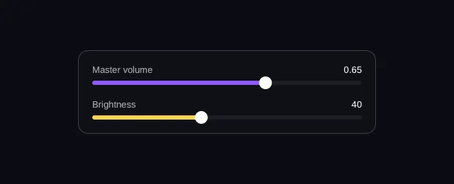
audio settings panel: the Master volume row is a slider writing into a number
the game owns, with a Text bound to the same path showing it. It is the mirror
of a ProgressBar — the same geometry, but a
slider is set by the player and a bar is set by the game.
- hover — off
- pressed — off
- focused — off
- selected — off
- disabled — off
Reported from the last painted frame
Not running — press Run to draw this on the GPU.
import { Column, Row, Slider, Text } from "@zabloo/react";


const TRACK = { background: "{color.slot}", radius: "{radius.pill}" } as const;
const FILL = { background: "{color.brand}", radius: "{radius.pill}" } as const;
const THUMB = { background: "{color.text}", radius: "{radius.pill}" } as const;

export default function SliderRange() {
  return (
    <Column
      layout={{ grow: 1, justify: "center", align: "center", padding: "{space.6}" }}
      style={{ background: "{color.bg}" }}
    >
      <Column
        id="panel"
        layout={{ width: 420, padding: "{space.5}", gap: "{space.5}", align: "stretch" }}
        style={{
          background: "{color.surface}",
          radius: "{radius.lg}",
          borderWidth: "{border.hairline}",
          borderColor: "{color.line}",
        }}
      >
        <Column layout={{ gap: "{space.2}", align: "stretch" }}>
          <Row layout={{ justify: "space-between", align: "center" }}>
            <Text style={{ color: "{color.muted}", fontSize: "{text.sm}" }}>Master volume</Text>
            {/* Same path as the slider. The label follows the drag because both
                read the game's data, not each other. */}
            <Text bind="settings.volume" style={{ color: "{color.text}", fontSize: "{text.sm}" }} />
          </Row>
          {/* Continuous: the two hooks split the two questions a game asks about
              a drag — preview it live, apply it once the player lets go. */}
          <Slider
            id="volume"
            value={{ bind: "settings.volume" }}
            onChange="volume-preview"
            onCommit="volume-apply"
            length={380}
            style={TRACK}
            fill={FILL}
            thumb={THUMB}
          />
        </Column>

        <Column layout={{ gap: "{space.2}", align: "stretch" }}>
          <Row layout={{ justify: "space-between", align: "center" }}>
            <Text style={{ color: "{color.muted}", fontSize: "{text.sm}" }}>Brightness</Text>
            <Text
              bind="settings.brightness"
              style={{ color: "{color.text}", fontSize: "{text.sm}" }}
            />
          </Row>
          {/* Quantized to min + k · step. `max` is always a valid stop, even when
              the range is not a whole number of steps. */}
          <Slider
            id="brightness"
            value={{ bind: "settings.brightness" }}
            min={0}
            max={100}
            step={10}
            onCommit="brightness-apply"
            length={380}
            style={TRACK}
            fill={{ background: "{color.gold}", radius: "{radius.pill}" }}
            thumb={THUMB}
          />
        </Column>
      </Column>
    </Column>
  );
}
{
"v": 1,
"tokens": {
"color.bg": "#0b0d13",
"color.surface": "#0e1016",
"color.raised": "#14141a",
"color.line": "#ffffff1f",
"color.line-strong": "#ffffff24",
"color.text": "#ffffff",
"color.muted": "#a1a1aa",
"color.faint": "#8a8a93",
"color.on-brand": "#ffffff",
"color.brand": "#8b5cf6",
"color.brand-strong": "#7c3aed",
"color.brand-hover": "#8b5cf6",
"color.brand-pressed": "#6d28d9",
"color.brand-soft": "#8b5cf61f",
"color.gold": "#fcd34d",
"color.slot": "#ffffff08",
"color.danger": "#f87171",
"radius.sm": 6,
"radius.md": 10,
"radius.lg": 14,
"radius.pill": 999,
"border.hairline": 1,
"border.focus": 2,
"space.1": 4,
"space.2": 8,
"space.3": 12,
"space.4": 16,
"space.5": 20,
"space.6": 24,
"text.xs": 11,
"text.sm": 13,
"text.md": 15,
"text.lg": 17,
"motion.fast": 120,
"motion.loop": 900
},
"views": {
"slider-range": {
"type": "Container",
"layout": {
"direction": "column",
"grow": 1,
"justify": "center",
"align": "center",
"padding": "{space.6}"
},
"style": {
"background": "{color.bg}"
},
"children": [
{
"type": "Container",
"id": "panel",
"layout": {
"direction": "column",
"width": 420,
"padding": "{space.5}",
"gap": "{space.5}",
"align": "stretch"
},
"style": {
"background": "{color.surface}",
"radius": "{radius.lg}",
"borderWidth": "{border.hairline}",
"borderColor": "{color.line}"
},
"children": [
{
"type": "Container",
"layout": {
"direction": "column",
"gap": "{space.2}",
"align": "stretch"
},
"children": [
{
"type": "Container",
"layout": {
"direction": "row",
"justify": "space-between",
"align": "center"
},
"children": [
{
"type": "Text",
"style": {
"color": "{color.muted}",
"fontSize": "{text.sm}"
},
"text": "Master volume"
},
{
"type": "Text",
"style": {
"color": "{color.text}",
"fontSize": "{text.sm}"
},
"text": {
"bind": "settings.volume"
}
}
]
},
{
"type": "Slider",
"id": "volume",
"layout": {
"width": 380,
"height": 6
},
"style": {
"radius": "{radius.pill}",
"background": "{color.slot}"
},
"value": {
"bind": "settings.volume"
},
"onChange": "volume-preview",
"onCommit": "volume-apply",
"children": [
{
"type": "Container",
"layout": {
"height": 6
},
"style": {
"radius": "{radius.pill}",
"background": "{color.brand}"
}
},
{
"type": "Container",
"layout": {
"width": 18,
"height": 18
},
"style": {
"radius": "{radius.pill}",
"background": "{color.text}"
}
}
]
}
]
},
{
"type": "Container",
"layout": {
"direction": "column",
"gap": "{space.2}",
"align": "stretch"
},
"children": [
{
"type": "Container",
"layout": {
"direction": "row",
"justify": "space-between",
"align": "center"
},
"children": [
{
"type": "Text",
"style": {
"color": "{color.muted}",
"fontSize": "{text.sm}"
},
"text": "Brightness"
},
{
"type": "Text",
"style": {
"color": "{color.text}",
"fontSize": "{text.sm}"
},
"text": {
"bind": "settings.brightness"
}
}
]
},
{
"type": "Slider",
"id": "brightness",
"layout": {
"width": 380,
"height": 6
},
"style": {
"radius": "{radius.pill}",
"background": "{color.slot}"
},
"value": {
"bind": "settings.brightness"
},
"min": 0,
"max": 100,
"step": 10,
"onCommit": "brightness-apply",
"children": [
{
"type": "Container",
"layout": {
"height": 6
},
"style": {
"radius": "{radius.pill}",
"background": "{color.gold}"
}
},
{
"type": "Container",
"layout": {
"width": 18,
"height": 18
},
"style": {
"radius": "{radius.pill}",
"background": "{color.text}"
}
}
]
}
]
}
]
}
]
}
}
}The two tables below differ in a way worth naming, because it is what the
component layer is doing for you: length, thickness and thumbSize are
convenient numbers to write and are gone by the time anything ships — they
resolve into the node’s layout and the two slots’ sizes. An explicit layout
still wins over them.
Authoring props
<Slider> emits this node with both slots already built. There is no raw
export that would leave them to you: the positions are a convention, and the
component is the one place it is written down.
| Prop | Type | Default | Description |
|---|---|---|---|
| value | Bindable<number> | min | Current value, or a read/write binding. |
| min / max | number | 0 / 1 | The range ends — the unit interval a volume or a ratio lives in. |
| step | number | absent | Quantization step. Absent = continuous. |
| axis | "horizontal" | "vertical" | "horizontal" | Track orientation. Vertical runs bottom-to-top, like a fader. |
| onChange / onCommit | string | absent | The live hook and the settled one. |
| length / thickness / thumbSize | number | 200 / 6 / 18 | Track length and thickness, and the handle's size, in px. |
| fill / thumb | Style | absent | The filled part of the track, and the handle that rides it. |
On top of these, every component takes the node base props — id, visible,
disabled, layout, style, states, transition, autofocus, clip —
plus variant, which the theme resolves away at export time and which never
appears in the IR.
IR props
What ships to the game, after the authoring layer is gone.
| Prop | Type | Default | Description |
|---|---|---|---|
| value | Bindable<number> | min | Current value, or a read/write binding. |
| min / max | number | 0 / 1 | The ends of the range. |
| step | number | absent | Quantization step from min. Absent or <= 0 = continuous. |
| axis | "horizontal" | "vertical" | "horizontal" | Track orientation. |
| onChange | string | absent | Named action fired on every value change. |
| onCommit | string | absent | Named action fired when a gesture ends. |
| children | ZNode[] | [] | Two positional slots — the fill, then the thumb. |
The node is the track
Its style paints the rail through the ordinary implicit paint — no new draw
command, no third slot — and it takes exactly two positional children that the
SDK arranges from the value instead of laying them out in flow:
| Slot | What it is | How the SDK places it |
|---|---|---|
children[0] | the fill | from the track’s start to the value’s fraction |
children[1] | the thumb | its own size, centered on the value’s position |
The thumb’s travel is inset by half its own size, so it never paints outside
the node’s rect — the border-box invariant holds and hit-testing on layout rects
stays honest. And a Slider measures as a leaf: the slots never contribute
to its size, which is why an 18px thumb cannot define a 200px track.
Value
value is either a literal initial number or a read/write
binding: the SDK writes every new value into its data store
and notifies the game. It is clamped to [min, max] and, with a step,
quantized to min + k · step.
max is always a valid stop even when the range is not a whole number of steps —
0..1 by 0.3 stops at 0.9 and then at 1. The player can see the end of the
track, so leaving it unreachable would read as a stuck control; the price is a
short last step, which is the smaller surprise. An unusable range (max <= min,
NaN, a negative step) collapses to a fixed slider rather than to an error.
onChange fires on every change, however it was caused — the live hook a volume preview
follows. onCommit fires when the gesture ends (pointer release, arrow key up): the
value the player settled on, where the expensive-to-apply setting hangs instead of the game
debouncing on its side. A bound value is written on every change regardless of which
hooks are declared.
Behavior
- States
hover,pressedandfocused, plusdisabled— its own or inherited.pressedis the drag: it lasts as long as the pointer holds the control, and the arrow keys that step the value never raise it, because there is nothing to activate. A gesture in flight when the game disables the control is cancelled, never committed — the value never settled.- Focusable
Yes, unless
disabled. It keeps the arrow keys on its own axis and never gives them back; the cross-axis arrows keep navigating. A continuous slider borrows a step of 5% of its range for the keyboard, so the arrows work without forcing you to declare astepyou do not otherwise want.- Motion
With a
transition, the SDK glides to a value the game pushed and snaps to one the player is dragging. A control must never lag behind the finger.- Actions
The player drags → the SDK clamps and quantizes the number, writes it into the data, and moves the fill and the thumb →
onChangefires. When the player lets go,onCommitfires as well — two named actions, one gesture. From the other direction,SetValue(id, value)runs that whole sequence in one call.
Degradation
On an older SDK the rail, the fill and the handle all show, but the handle sits wherever the layout put it and dragging does nothing.
As a Container: the rail, with an unsized fill and a thumb laid out in flow beside it. Inert. The two slots survive because they are ordinary nodes — what is lost is the arrangement the value drove, which is the one thing this type exists to compute.
How the game hears this
The binding carries the number; the action only says when it moved. No action in v1 carries a value, so the figure itself arrives on the data channel, through the read/write binding — the leg that exists for exactly that. What the two actions add is timing, and splitting them is the point: previewing a volume on every frame of a drag is cheap, while re-applying a graphics preset is not.
using UnityEngine;
using Zabloo;

[RequireComponent(typeof(ZablooDocument))]
public sealed class AudioOptions : MonoBehaviour
{
  ZablooDocument _doc;

  void Start()
  {
      _doc = GetComponent<ZablooDocument>();
      _doc.OnAction += OnZablooAction;

      // The slider reads the game's own value through its binding.
      _doc.SetData("settings.volume", AudioListener.volume);
  }

  void OnDestroy()
  {
      if (_doc != null) _doc.OnAction -= OnZablooAction;
  }

  void OnZablooAction(string action)
  {
      // Follow the drag with something cheap...
      if (action == "volume-preview") PlayTickSound();

      // ...and do the expensive part once, when the player lets go.
      if (action == "volume-apply") SaveAudioSettings();
  }
}
Composition
The component builds the fill and the thumb; you style them. Everything else is the ordinary layout you would give any node.
- Continuous, with both hooks — use this for a setting you can preview while it is being dragged and want to apply once, on release.
- Quantized and vertical — use
stepandaxisfor a mixer fader, where the notches are part of the control. - Styled — the node is the rail, so its own style paints the groove; use
fillandthumbfor the two pieces the value moves. - Neither of the above — a number the player only reads is a
ProgressBar, not aSliderwith the input turned off.
// Continuous, both hooks, bound to the game's data.
<Slider value={{ bind: "settings.volume" }} onChange="volume-preview" onCommit="volume-apply" />

// Quantized and vertical: a fader, running bottom-to-top.
<Slider min={0} max={100} step={10} axis="vertical" length={120} />

// Styled: the node is the rail, so its own style paints the groove.
<Slider
value={{ bind: "settings.volume" }}
style={{ background: "{color.slot}", radius: "{radius.pill}" }}
fill={{ background: "{color.brand}", radius: "{radius.pill}" }}
thumb={{ background: "{color.text}", radius: "{radius.pill}" }}
/>

// A read-only number is not a Slider. A fraction of the parent is a ProgressBar.
<ProgressBar value={{ bind: "player.hp" }} />