 zabloo
Container
La caja que agrupa otros nodos y los coloca. No dibuja nada propio — y un solo campo suyo le da un comportamiento compartido a todo un conjunto de hijos.
primitivedesde v1sin focus
Un Container es una caja que contiene otros nodos y
decide dónde van. No tiene contenido ni tamaño propios: es tan grande como lo que
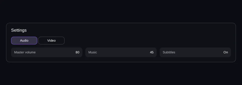
lleva dentro, o como el hueco que le dé su padre. Piensa en un panel de ajustes:
la tarjeta, su fila de título, la barra de pestañas y el contenido de cada
pestaña son todos Containers, unos dentro de otros. Usas uno siempre que algo
necesita agruparse, separarse o llevar una dirección, que en la práctica es casi
toda una pantalla.
Viewport: 960 × 340
- hover — inactivo
- pressed — inactivo
- focused — inactivo
- selected — inactivo
- disabled — inactivo
Se lee del último frame dibujado
Parado: pulsa Ejecutar para dibujarlo en la GPU.
import { Column, Row, Tab, Tabs, Text } from "@zabloo/react";


/**
 * One "setting: value" line: a Row, and the flex pass doing all the work.
 *
 * `width` plus `grow` is what lets the panel below wrap them (ZAB-153): the
 * width is the base a wrapping row measures against, and `grow` shares out
 * whatever the line it lands on has left. Three across a desktop, two on a
 * tablet, one on a phone — decided by arithmetic, not by a breakpoint.
 */
function Line({ name, value }: { name: string; value: string }) {
  return (
    <Row
      layout={{
        width: 240,
        grow: 1,
        padding: "{space.3}",
        justify: "space-between",
        align: "center",
      }}
      style={{ background: "{color.slot}", radius: "{radius.md}" }}
    >
      <Text style={{ color: "{color.muted}", fontSize: "{text.sm}" }}>{name}</Text>
      <Text style={{ color: "{color.text}", fontSize: "{text.sm}" }}>{value}</Text>
    </Row>
  );
}

export default function ContainerTabs() {
  return (
    <Column
      // `align: "stretch"` on the ROOT is what hands the panel the view's own
      // width; centring it instead would pin the panel to its content and no
      // change of viewport could reach it (ZAB-153).
      layout={{ grow: 1, justify: "center", align: "stretch", padding: "{space.6}" }}
      style={{ background: "{color.bg}" }}
    >
      <Column
        id="panel"
        // `align: "stretch"` is what gives the children the panel's full width;
        // without it they measure to their content and `space-between` above has
        // no leftover space to distribute.
        layout={{ padding: "{space.5}", gap: "{space.4}", align: "stretch" }}
        style={{
          background: "{color.surface}",
          radius: "{radius.lg}",
          borderWidth: "{border.hairline}",
          borderColor: "{color.line}",
        }}
      >
        <Text style={{ color: "{color.text}", fontSize: "{text.lg}" }}>Settings</Text>

        {/* One `group` field, and the SDK shows exactly one panel. A `<Tab>`'s
            own props dress its BAR BUTTON — the active one through
            `states.selected`, a state the group derives. */}
        <Tabs
          selected={0}
          bar={{ layout: { gap: "{space.1}" } }}
          // The group is a Container like any other: without `stretch` the
          // panel below would measure to its own content instead of taking the
          // width the settings card offers it.
          layout={{ gap: "{space.3}", align: "stretch" }}
        >
          <Tab
            variant="secondary"
            layout={{ width: 104, padding: "{space.2}", justify: "center", align: "center" }}
            states={{
              selected: {
                style: { background: "{color.brand-soft}", borderColor: "{color.brand}" },
              },
            }}
            label={<Text style={{ color: "{color.text}", fontSize: "{text.sm}" }}>Audio</Text>}
            // The surface moved to the lines themselves: laid side by side on a
            // wide viewport, one shared background reads as a single strip of
            // text rather than as three settings.
            panel={{ layout: { gap: "{space.2}", align: "stretch" } }}
          >
            <Row layout={{ wrap: true, gap: "{space.3}", align: "start" }}>
              <Line name="Master volume" value="80" />
              <Line name="Music" value="45" />
              <Line name="Subtitles" value="On" />
            </Row>
          </Tab>

          <Tab
            variant="secondary"
            layout={{ width: 104, padding: "{space.2}", justify: "center", align: "center" }}
            states={{
              selected: {
                style: { background: "{color.brand-soft}", borderColor: "{color.brand}" },
              },
            }}
            label={<Text style={{ color: "{color.text}", fontSize: "{text.sm}" }}>Video</Text>}
            // The surface moved to the lines themselves: laid side by side on a
            // wide viewport, one shared background reads as a single strip of
            // text rather than as three settings.
            panel={{ layout: { gap: "{space.2}", align: "stretch" } }}
          >
            <Row layout={{ wrap: true, gap: "{space.3}", align: "start" }}>
              <Line name="Resolution" value="1920 × 1080" />
              <Line name="Quality" value="High" />
              <Line name="Fullscreen" value="On" />
            </Row>
          </Tab>
        </Tabs>
      </Column>
    </Column>
  );
}
{
"v": 1,
"tokens": {
"color.bg": "#0b0d13",
"color.surface": "#0e1016",
"color.raised": "#14141a",
"color.line": "#ffffff1f",
"color.line-strong": "#ffffff24",
"color.text": "#ffffff",
"color.muted": "#a1a1aa",
"color.faint": "#8a8a93",
"color.on-brand": "#ffffff",
"color.brand": "#8b5cf6",
"color.brand-strong": "#7c3aed",
"color.brand-hover": "#8b5cf6",
"color.brand-pressed": "#6d28d9",
"color.brand-soft": "#8b5cf61f",
"color.gold": "#fcd34d",
"color.slot": "#ffffff08",
"color.danger": "#f87171",
"radius.sm": 6,
"radius.md": 10,
"radius.lg": 14,
"radius.pill": 999,
"border.hairline": 1,
"border.focus": 2,
"space.1": 4,
"space.2": 8,
"space.3": 12,
"space.4": 16,
"space.5": 20,
"space.6": 24,
"text.xs": 11,
"text.sm": 13,
"text.md": 15,
"text.lg": 17,
"motion.fast": 120,
"motion.loop": 900
},
"views": {
"container-tabs": {
"type": "Container",
"layout": {
"direction": "column",
"grow": 1,
"justify": "center",
"align": "stretch",
"padding": "{space.6}"
},
"style": {
"background": "{color.bg}"
},
"children": [
{
"type": "Container",
"id": "panel",
"layout": {
"direction": "column",
"padding": "{space.5}",
"gap": "{space.4}",
"align": "stretch"
},
"style": {
"background": "{color.surface}",
"radius": "{radius.lg}",
"borderWidth": "{border.hairline}",
"borderColor": "{color.line}"
},
"children": [
{
"type": "Text",
"style": {
"color": "{color.text}",
"fontSize": "{text.lg}"
},
"text": "Settings"
},
{
"type": "Container",
"layout": {
"direction": "column",
"gap": "{space.3}",
"align": "stretch"
},
"group": "exclusive-select",
"selected": 0,
"children": [
{
"type": "Container",
"layout": {
"direction": "row",
"gap": "{space.1}"
},
"children": [
{
"type": "Button",
"layout": {
"width": 104,
"padding": "{space.2}",
"justify": "center",
"align": "center"
},
"style": {
"background": "#00000000",
"borderWidth": "{border.hairline}",
"borderColor": "{color.line-strong}",
"radius": "{radius.md}",
"color": "{color.text}"
},
"states": {
"hover": {
"style": {
"background": "{color.slot}"
}
},
"pressed": {
"style": {
"background": "{color.brand-soft}"
}
},
"focused": {
"style": {
"borderWidth": "{border.focus}",
"borderColor": "{color.brand}"
}
},
"disabled": {
"style": {
"opacity": 0.45
}
},
"selected": {
"style": {
"background": "{color.brand-soft}",
"borderColor": "{color.brand}"
}
}
},
"transition": {
"duration": "{motion.fast}"
},
"children": [
{
"type": "Text",
"style": {
"color": "{color.text}",
"fontSize": "{text.sm}"
},
"text": "Audio"
}
]
},
{
"type": "Button",
"layout": {
"width": 104,
"padding": "{space.2}",
"justify": "center",
"align": "center"
},
"style": {
"background": "#00000000",
"borderWidth": "{border.hairline}",
"borderColor": "{color.line-strong}",
"radius": "{radius.md}",
"color": "{color.text}"
},
"states": {
"hover": {
"style": {
"background": "{color.slot}"
}
},
"pressed": {
"style": {
"background": "{color.brand-soft}"
}
},
"focused": {
"style": {
"borderWidth": "{border.focus}",
"borderColor": "{color.brand}"
}
},
"disabled": {
"style": {
"opacity": 0.45
}
},
"selected": {
"style": {
"background": "{color.brand-soft}",
"borderColor": "{color.brand}"
}
}
},
"transition": {
"duration": "{motion.fast}"
},
"children": [
{
"type": "Text",
"style": {
"color": "{color.text}",
"fontSize": "{text.sm}"
},
"text": "Video"
}
]
}
]
},
{
"type": "Container",
"layout": {
"gap": "{space.2}",
"align": "stretch"
},
"children": [
{
"type": "Container",
"layout": {
"direction": "row",
"wrap": true,
"gap": "{space.3}",
"align": "start"
},
"children": [
{
"type": "Container",
"layout": {
"direction": "row",
"width": 240,
"grow": 1,
"padding": "{space.3}",
"justify": "space-between",
"align": "center"
},
"style": {
"background": "{color.slot}",
"radius": "{radius.md}"
},
"children": [
{
"type": "Text",
"style": {
"color": "{color.muted}",
"fontSize": "{text.sm}"
},
"text": "Master volume"
},
{
"type": "Text",
"style": {
"color": "{color.text}",
"fontSize": "{text.sm}"
},
"text": "80"
}
]
},
{
"type": "Container",
"layout": {
"direction": "row",
"width": 240,
"grow": 1,
"padding": "{space.3}",
"justify": "space-between",
"align": "center"
},
"style": {
"background": "{color.slot}",
"radius": "{radius.md}"
},
"children": [
{
"type": "Text",
"style": {
"color": "{color.muted}",
"fontSize": "{text.sm}"
},
"text": "Music"
},
{
"type": "Text",
"style": {
"color": "{color.text}",
"fontSize": "{text.sm}"
},
"text": "45"
}
]
},
{
"type": "Container",
"layout": {
"direction": "row",
"width": 240,
"grow": 1,
"padding": "{space.3}",
"justify": "space-between",
"align": "center"
},
"style": {
"background": "{color.slot}",
"radius": "{radius.md}"
},
"children": [
{
"type": "Text",
"style": {
"color": "{color.muted}",
"fontSize": "{text.sm}"
},
"text": "Subtitles"
},
{
"type": "Text",
"style": {
"color": "{color.text}",
"fontSize": "{text.sm}"
},
"text": "On"
}
]
}
]
}
]
},
{
"type": "Container",
"layout": {
"gap": "{space.2}",
"align": "stretch"
},
"children": [
{
"type": "Container",
"layout": {
"direction": "row",
"wrap": true,
"gap": "{space.3}",
"align": "start"
},
"children": [
{
"type": "Container",
"layout": {
"direction": "row",
"width": 240,
"grow": 1,
"padding": "{space.3}",
"justify": "space-between",
"align": "center"
},
"style": {
"background": "{color.slot}",
"radius": "{radius.md}"
},
"children": [
{
"type": "Text",
"style": {
"color": "{color.muted}",
"fontSize": "{text.sm}"
},
"text": "Resolution"
},
{
"type": "Text",
"style": {
"color": "{color.text}",
"fontSize": "{text.sm}"
},
"text": "1920 × 1080"
}
]
},
{
"type": "Container",
"layout": {
"direction": "row",
"width": 240,
"grow": 1,
"padding": "{space.3}",
"justify": "space-between",
"align": "center"
},
"style": {
"background": "{color.slot}",
"radius": "{radius.md}"
},
"children": [
{
"type": "Text",
"style": {
"color": "{color.muted}",
"fontSize": "{text.sm}"
},
"text": "Quality"
},
{
"type": "Text",
"style": {
"color": "{color.text}",
"fontSize": "{text.sm}"
},
"text": "High"
}
]
},
{
"type": "Container",
"layout": {
"direction": "row",
"width": 240,
"grow": 1,
"padding": "{space.3}",
"justify": "space-between",
"align": "center"
},
"style": {
"background": "{color.slot}",
"radius": "{radius.md}"
},
"children": [
{
"type": "Text",
"style": {
"color": "{color.muted}",
"fontSize": "{text.sm}"
},
"text": "Fullscreen"
},
{
"type": "Text",
"style": {
"color": "{color.text}",
"fontSize": "{text.sm}"
},
"text": "On"
}
]
}
]
}
]
}
]
}
]
}
]
}
}
}Las dos tablas de abajo son casi la misma, y eso merece señalarse en vez de
esconderse: lo que escribes y lo que se publica son normalmente dos capas, y un
Container es el nodo con menos capa encima. <Row>, <Column>, <Tabs> y
<Accordion> son todos este mismo nodo con un direction o un group ya
rellenos por ti — que es exactamente por lo que no le cuestan nada al formato.
Props de autoría
Lo que escribes en @zabloo/react.
| Prop | Tipo | Por defecto | Descripción |
|---|---|---|---|
| group | "exclusive-open" | "exclusive-select" | "exclusive-check" | absent | Comportamiento entre hijos que hace cumplir el SDK. |
| selected | number | 0 | Índice seleccionado al principio en un grupo "exclusive-select". |
| value | Bindable<string | number> | absent | Valor seleccionado de un grupo "exclusive-check". |
| onChange | string | absent | Named action que se dispara cuando se mueve la selección de un grupo "exclusive-check". |
| children | ReactNode | absent | Cualquier nodo. |
Además de estas, todo componente acepta las props base del nodo —id,
visible, disabled, layout, style, states, transition, autofocus,
clip— más variant, que el theme resuelve al exportar y que nunca aparece en
la IR.
Props de IR
Lo que llega al juego, cuando ya no queda capa de autoría.
| Prop | Tipo | Por defecto | Descripción |
|---|---|---|---|
| group | "exclusive-open" | "exclusive-select" | "exclusive-check" | absent | El comportamiento. Un SDK que no lo conozca lo ignora. |
| selected | number | 0 | Índice inicial de un grupo "exclusive-select". En los demás se ignora. |
| value | Bindable<string | number> | absent | Selección de un grupo "exclusive-check". En los demás se ignora. |
| onChange | string | absent | Named action, se dispara cuando se mueve una selección "exclusive-check". |
| children | ZNode[] | [] | Hijos de flujo normales. |
Comportamiento
- Estados
Solo
disabled— y unContaineres el sitio habitual donde declararlo, porquedisabledse hereda: el jugador se encuentra una sección entera apagada desde una sola prop de aquí arriba, y cada control de dentro, etiquetas incluidas, se sigue vistiendo con su propiostates.disabled.- Focusable
No, y nada de lo que haga el jugador le llega: una caja nunca recibe hover, ni pulsación, ni focus, así que ningún otro
states.*suyo llega a aplicarse. Sus hijos conservan los suyos.- Layout
El paso de flex, y nada más:
direction,justify,align,gap,padding,wrap. UnContainerno tiene tamaño intrínseco — es tan grande como sus hijos, como sulayouto como el hueco que le dé un padre.- Actions
onChange, y solo como grupo"exclusive-check": el jugador elige una opción → el valor del grupo se mueve → el juego oye el nombre. Esa selección es lo único que unContainerllega a tener, así que es lo único que puede reportar. No hayonClick— una caja no se pulsa, y una caja que se pulsa es unButton.
Degradación
En un SDK más antiguo la barra de pestañas se sigue viendo, pero todos los paneles quedan apilados debajo a la vez en lugar de uno cada vez.
Un Container es él mismo el fallback: un tipo de nodo desconocido se dibuja como uno, y por eso un contenido más nuevo que el SDK que lo lee degrada a un layout y no a nada. Lo que aquí puede quedarse antiguo es el group: un SDK que no conozca 'exclusive-select' coloca a los hijos como hermanos normales. Usable, y a la vista que no es lo que escribiste.
Los comportamientos de grupo
Un acordeón, una barra de pestañas y un grupo de radios no son tipos de nodo aquí. Cada uno es un composite —se aplana a primitives mientras lo escribes— y el comportamiento que necesita entre sus hijos se declara con un solo campo que el SDK implementa de forma genérica: un comportamiento, un estado que gobierna, y ningún cableado de ids por ninguna parte del JSON.
Eso es lo que hace asumible el conjunto cerrado de trece. En un formato que
creciera por nombres, esos tres serían tres tipos de nodo; aquí son tres valores
de group.
| Comportamiento | Composite | El estado que gobierna |
|---|---|---|
"exclusive-open" | Accordion | el open de los Collapse hijos |
"exclusive-select" | Tabs | selected — un índice |
"exclusive-check" | RadioGroup, Select | el checked de los Toggle descendientes |
exclusive-open
Cuando un Collapse hijo se abre, sus
hermanos se cierran. No cambia nada más: cada uno conserva su cabecera, su
contenido y su open inicial. Un SDK más antiguo deja collapses independientes,
con tantos abiertos a la vez como quieras.
exclusive-select
Se ve exactamente un hijo cada vez, y el contrato es posicional:
children[0]es la barra, y sus hijos son los botones de pestaña.children[1..n]son los paneles, uno por botón, en el orden de la barra.
Seleccionar el índice i mete children[i + 1] en el layout —sus hermanos
salen de él, con la semántica de display:none— y le da al botón i de la barra
el estado selected. El selected del grupo es el índice inicial; la
selección en tiempo de ejecución es del SDK, y el juego la mueve por el
host channel.
exclusive-check
Hay un Toggle descendiente marcado,
identificado por valor y no por posición: el value del grupo es la
selección, y el value de cada Toggle es su opción. Un toggle está marcado
mientras los dos son iguales, y tocar uno escribe su propio value en el del
grupo — en los datos del juego, cuando ese sea un
binding. El estado checked de un toggle agrupado es
derivado, nunca se guarda por nodo.
El grupo es el dueño del valor, así que es el nodo que puede decir la selección se ha movido;
el onChange propio de un Toggle solo llega a decir me han tocado a mí, que no es la
pregunta que hace un desplegable. Declara los dos y se disparan los dos, primero el de la
opción. Como toda action de la v1, no lleva valor propio — el valor vuelve por el canal de
datos, que es la pata que existe exactamente para eso.
La selección es UN valor, y por eso el mismo comportamiento sostiene a la vez un grupo de radios y un desplegable sin que ninguno de los dos necesite un mecanismo propio.
Composición
Cinco de los nombres que exporta @zabloo/react son este nodo con algo ya
relleno. Ninguno de ellos llega a la IR.
<Row>/<Column>— úsalos en vez de escribirdirectiona mano, que es casi siempre.<Accordion>— cuando solo deba estar abierta una sección de una lista a la vez, como en una página de ajustes larga.<Tabs>— cuando varios paneles compiten por el mismo rectángulo y el jugador elige uno.<Badge>— para una cuenta que viene del juego, como el correo sin leer.
// Row and Column: a Container with a direction. Your own layout still wins.
<Row layout={{ gap: 8, align: "center" }}>…</Row>
<Column layout={{ gap: 4 }}>…</Column>

// Accordion: group: "exclusive-open". Its children should be Collapses.
<Accordion layout={{ gap: 8 }}>
<Collapse open={false}><Text>Audio</Text><Text>…</Text></Collapse>
<Collapse open={false}><Text>Video</Text><Text>…</Text></Collapse>
</Accordion>

// Tabs: group: "exclusive-select", with the positional contract built for you.
// A Tab's own props style its BAR BUTTON — the active one through states.selected.
<Tabs selected={0} bar={{ layout: { gap: 4 } }}>
<Tab label="Audio"><Text>Audio settings</Text></Tab>
<Tab label="Video" panel={{ layout: { padding: 12 } }}><Text>Video settings</Text></Tab>
</Tabs>

// Badge: a pill Container around a bound Text. It needs no IR of its own,
// because Text has been bindable since v1.
<Badge count={{ bind: "inbox.unread" }} />
No hay un “esconder al llegar a cero” en un Badge, y la razón vale para
todo lo demás: la IR no tiene expresiones. Enlaza visible a un flag del que sea
dueño el juego cuando algo tenga que desaparecer.
<Tabs> merece una línea más, porque es el único composite que construye un
contrato posicional en vez de rellenar un campo: cada <Tab> aporta un botón de
barra y un panel, en orden, así que quien lo escribe no cuenta hijos nunca. Un
<Tab> no se dibuja a sí mismo — <Tabs> lee sus props al escribir.